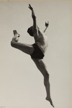
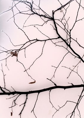
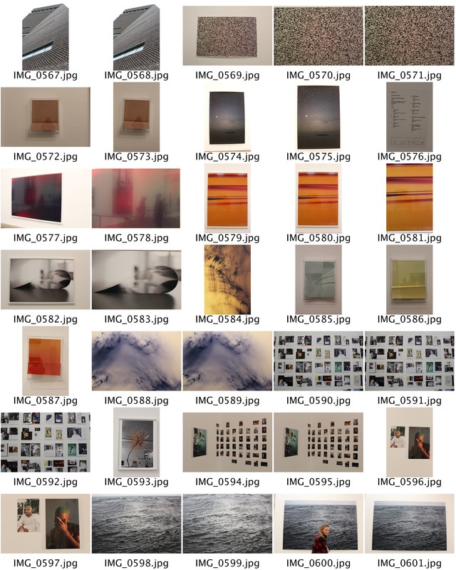
Exhibition Visit - The Radical Eye
The exhibition consists entirely of rare vintage prints, all created by the artists themselves, offering a unique opportunity to see remarkable works up close. The quality and depth of the collection allows the exhibition to tell the story of modernist photography in this way for the first time in the UK. It also marks the beginning of a long term relationship between Tate and The Sir Elton John Collection, as part of which Sir Elton and David Furnish have agreed to give important works to the nation. The work consist of original contacts, and famous pieces of artist votes. i think the framing of the images bring a sense of consistency to the collection as all the images are black and white, and framed in detailed gold frames, which adds the colour to the exhibition.
"Each of these photographs serves as inspiration for me in my life; they line the walls of my home
and I consider them precious gems. I want people to think, ‘I’ve never seen anything like that before,
never knew this kind of thing existed’ – just as I did when I first saw these photographs."
— Sir Elton John
Room1: THE RADICAL EYE
The beginning of modernism. Artists in the modernist period explored what the camera could do the human eye alone could not, and how this could be harnessed to present a new modern perspective on the world.
|
|
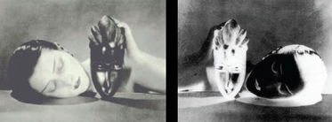
Man Ray's pairing of positive and negative images alludes to the technical process of the image's creation. the title 'Black and White' 1926, also refers to the elements in the composition; I found the that a Juxta position is created when we see the women face next to the West African ceremonial mask.
|
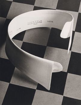
The first image on the left is titled 'Ide collar' published in 1922, by Paul Outbridge. iN the composition we see the collar as the main focal point as the contrast between the checkered background and the pure white collar makes it stand out and easier to see.
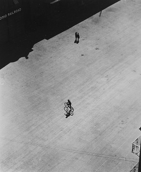
The second image titled 'Boy on Bike' published by Ralph Steiner in 1922 uses a wide scale to draw attention to the one person easier as there is not much else going on in the image the first time you look at it. i think the wide landscape makes us look more in depth of the image and we start to see the smaller details such as the symmetry in the imagery which is very effective as shadows creates layers and more detail can be seen.
The second image titled 'Boy on Bike' published by Ralph Steiner in 1922 uses a wide scale to draw attention to the one person easier as there is not much else going on in the image the first time you look at it. i think the wide landscape makes us look more in depth of the image and we start to see the smaller details such as the symmetry in the imagery which is very effective as shadows creates layers and more detail can be seen.
Room 2: Portraits
Modernist portraiture harnessed photography's capacity to render an accurate likeness in clear, sharp, focus and detail. But at the same time artists and sitters push the conventions of portraiture with innovations impose, composition and cropping.
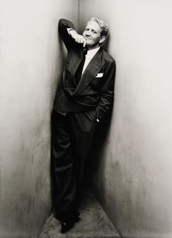
This particular portrait is of Spencer Tracy. His positioning and facial expression shows the audience a bit about him and his personality. We can see that this man is very confident and has a cheeky aspect within him, as his grin makes it seem as if he is 'up to something'
|
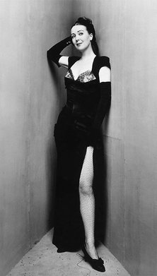
The model in this image is called Gypsy Rose Lee. Her long classic black dress represents class and sophistication and beauty. Her positioning of her arm on the wall makes her seem flirtatious, which correlates with her fish net tights, and the slit in her dress.
|
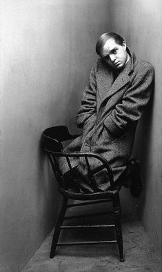
The character postioned in an awkward yet comfortable position is named Noel Coward. His positinoning shows that he is timid as he is hid away in the corner and keeping to himself, however his eyes are squiniting which might imply he is wise.
|
Room 3: Portraits/bodies
Experimental approches to shotting, cropping and framing could transform the human body into something unfamliar. Photographers started to focus on individual parts of the body, their unconventional crops drawing, attention to shape and form, accentuating curves and angles.
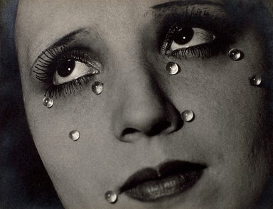
This photograph is titled 'glass tears' and is one of my favourites from the radical eye exhibition. The women's gaze shows her expression as she's looking up as if she were sighing or wishing for something. This makes us empathise for the girl as we begin to wonder what she is wishing for, as she is deep in thought. Her tears are infact like 'glass' this could be portrayed as a metaphor, as her tears are not real. This could mean she is holding them back to show her strenght and power as a women
|
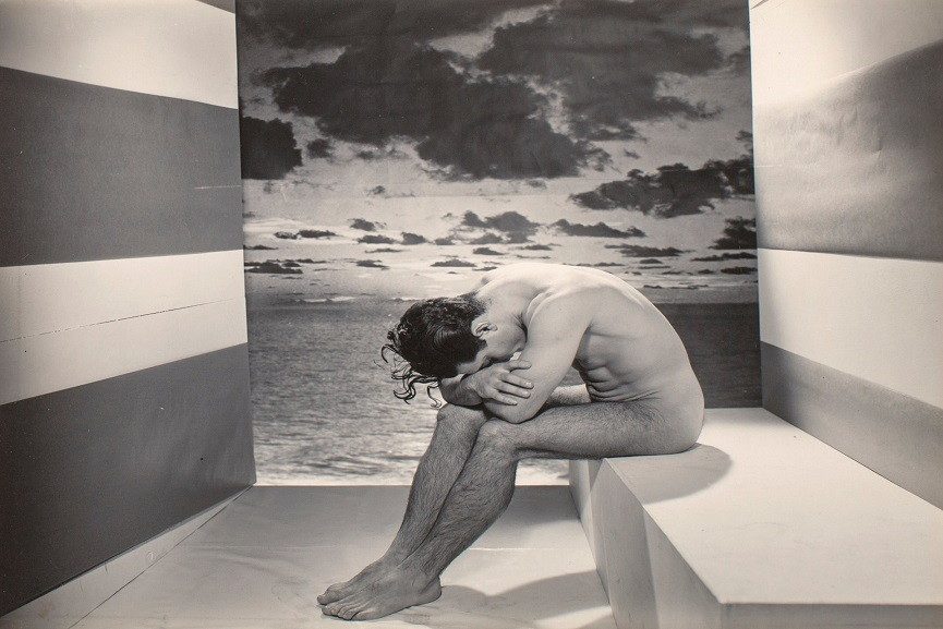
In this 'a forgotten model' photograph expression and thought is key. I think the picture represents sadness and regret, as the models positioning shows that his is upset his head is down which might imply he has done something wrong or bad. The composition of the image leads out eye because the back wall is supposed to be the seaside or ocean however the two side wall misleads this as they are both normal wallpapers which immediately confuses our eyes.
|
Room 4: Experiments
This was not a period of discovery but of rediscovery. artists were rewriting the preceding century's rules of photographic techniques, harnessing mistakes such as distortions and double exposures, or physically manipulating the printed image, cutting, marking and recombining photographs.
|
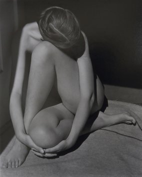
This image is titles 'Nude' by Edward Weston from 1927. The image consist of many different shapes i not only spotted the obvious circle and triangle but after studying the image you can find hexagons vocals semicircles, rectangles and much more. This creates layers and abstraction in the structure of the image. Edward Weston has manages to create shadows in the image using light creating contrast between her skin, shadows and the wall in the back. This makes the girl seem more abstract as the position she is in also makes the photograph seem more abstract as her body is folded in not a normal position. The fact that no facial expression is shown is effective as the emotion in the photograph comes from the positioning of the girls body which i think is representing sadness as her facing is facing down, and she is hiding away, which may be i sign of embarrassment. |
Room 5: Documents
During 1930s, photographers refined the formula for what we now know as social documentary. The development of new technology- particularly the portable camera and roll film- allowed photographers to capture spontaneous moments unfolding in the everyday world.
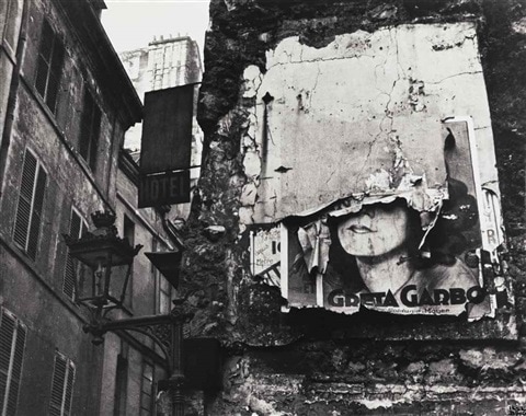
Iise Bing has positioned the ripped up Greta Carbo Poster for the centre view point of the photograph. although the poster is more on the right of the image the contrast between the white ripped and broken wall and the black surrounding draws our attention to it. The photograph has had an impact and created a comment the american dream, as it represents loss and distress, by he way the building is falling down and the rest of the surroundings looks abandoned. This could be giving us a message that at this certain time, life was not at its finest. The image is in black and white which increases the contrast and makes the image look older. i think the image is eye catching as the famous Greta carbo poster can still be recognised even though its half ripped. The fact that the eyes are ripped from the poster creates a loss of emotion in the photograph as eyes tell us a lot, and could have given us an insight of how she is.
|
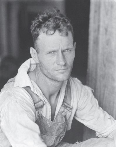
This Photograph was titled 'Floyd Burroughs' by Walter Evan. Evans was part of a group of photographers that were commissioned by the FSA, the farm security Administration, to the document the plight of very poor and impoverished workers during the depression in the US. I think that this image shows and represents this history well. My main focal point of this image are the mans eyes. i think the way his is gazing into the camera shows his pain and what he has been through. he is slightly squinting which shows he is wise and we can tell he is a worker.
|
Room 6: Objects, Perspectives, Abstractions
This final room shows the still life genre re-imagined by photographers who use the technical capabilities of the camera to reveal the beauty of everyday things. Objects captured at unconventional angles or extreme close-up become strange, even unrecognisable.
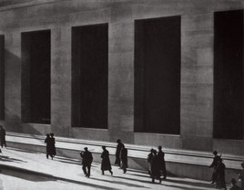
Paul Strand has positioned his view point of 'wall, street. NY' at an angle which creates the lighting and shadows of the photograph. The angle of the image makes it seem as if the windows are very big, which creates a perspective as the people at the bottom seem much smaller. The light is natural and coming from the left front of the image which is stretching the peoples shadows making them seem more significant.
|
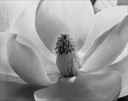
The 'Mongolian blossom' photographed by Imogene Cunningham in 1927 represents structure in a delicate way. The composition of the images presents the pure white, big leaves which are all surrounding the main focus point which draws our attention which is the centre bead of the flower. I think this is the centre as it brings more detail to the image as the rest of it is so simplistic, which keeps the viewers eyes on it for longer.
|
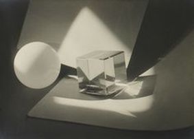
This photograph 'photographic construction' shows structure well. the different shapes are not only created by objects but also by shadows and light in the set up. The light is coming from the front and right side of the image which is creating the shadow and adding more shapes to the photograph. The image has been manipulated as although there is only two solid objects the lighting is creating more.
|
3 favourite images
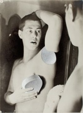
The title of this image is 'humanly impossible' created by Hebert Beyer. The main focus point in this image is interesting as your eye get pulled around the image to try and figure out what has happened as a piece of the mans arm is gone and he is holding it in his hands. his facial expression shows shock witch adds a comedy factor to the image, and he doesn't look like he is in pain. i think the image may be a metaphor which creates an enigma as it encourages the viewers to try to understand whats actually happening.
|
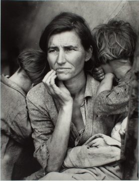
This image is titles "migrant mother'" it was my favourite image in the whole exhibition as i feel like the emotions in the image tell the mothers whole story and it really makes you engage with the picture. The two young children in the background are facing the opposite way to there mum which shows sadness and might even signify pain and/or passed experience trauma. this piece of work comes from the documents part of the exhibition in room 5. i think this room was especially engaging as each image told a story.
|
The black and white composition in this image is important as it creates the shadows and tones which help the image develop its features and structure. This was one of the favourite pieces of work in the exhibition and was an original contact frames in a beautiful gold frame. i think that the scale between the small image and big frame is effective as it gives us a realism effective and we seem to understand that the image isn't real but we tend to forget that all photographs are from real life.
|
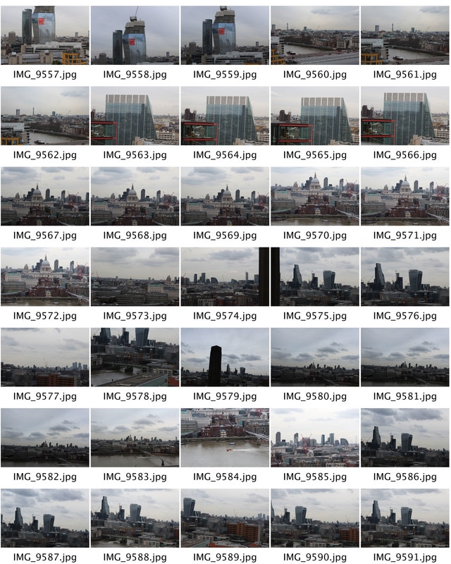
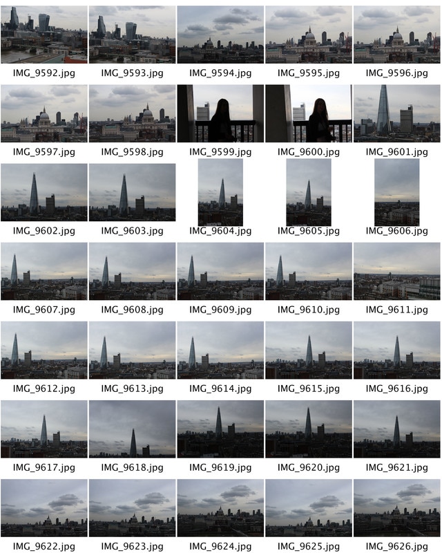
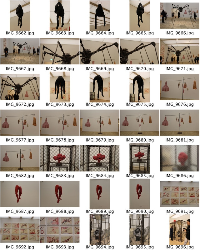
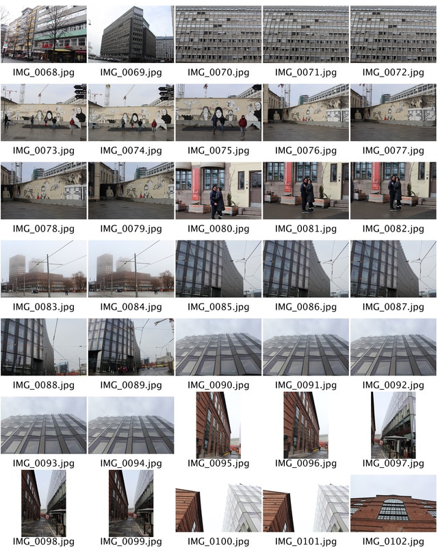
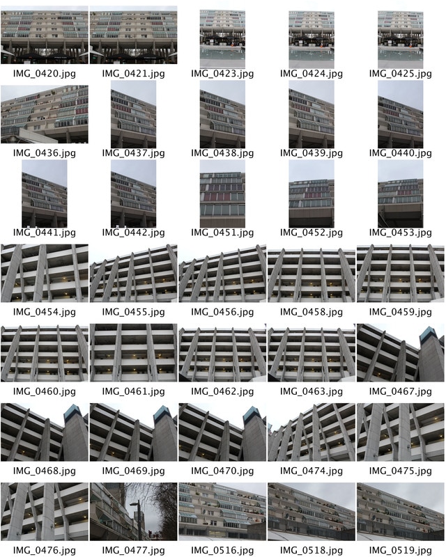
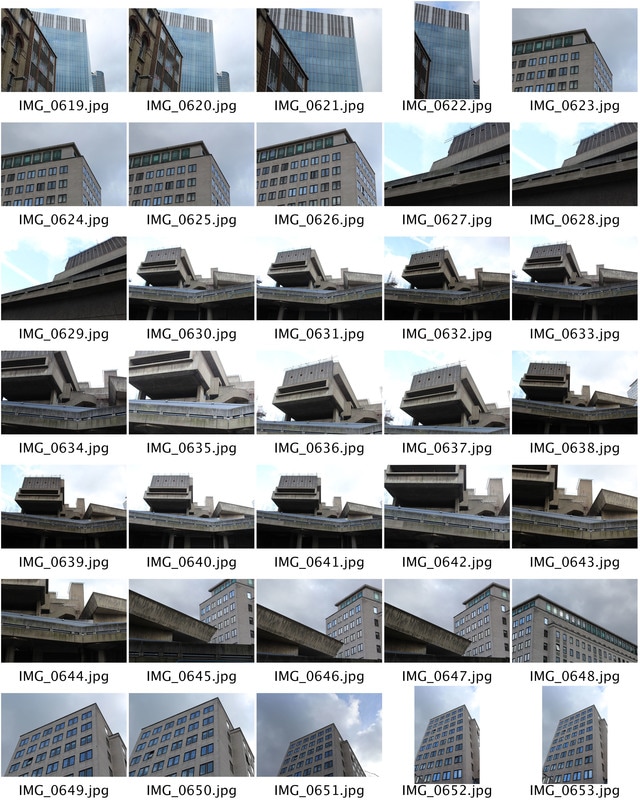
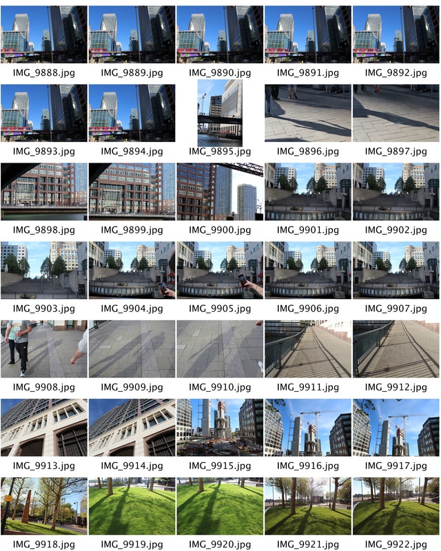
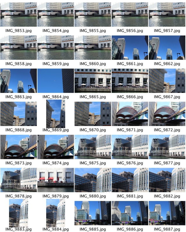
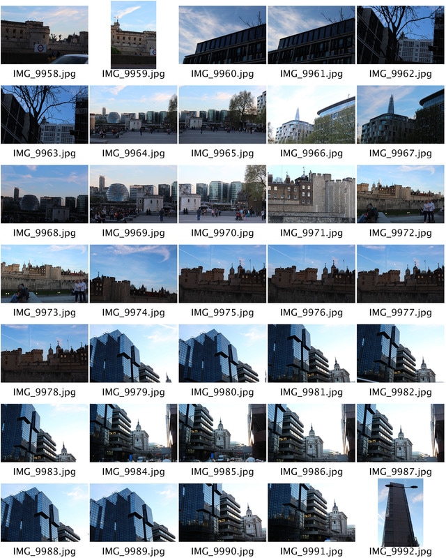
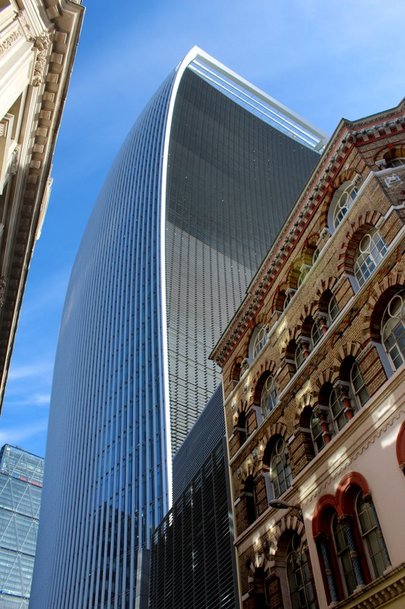
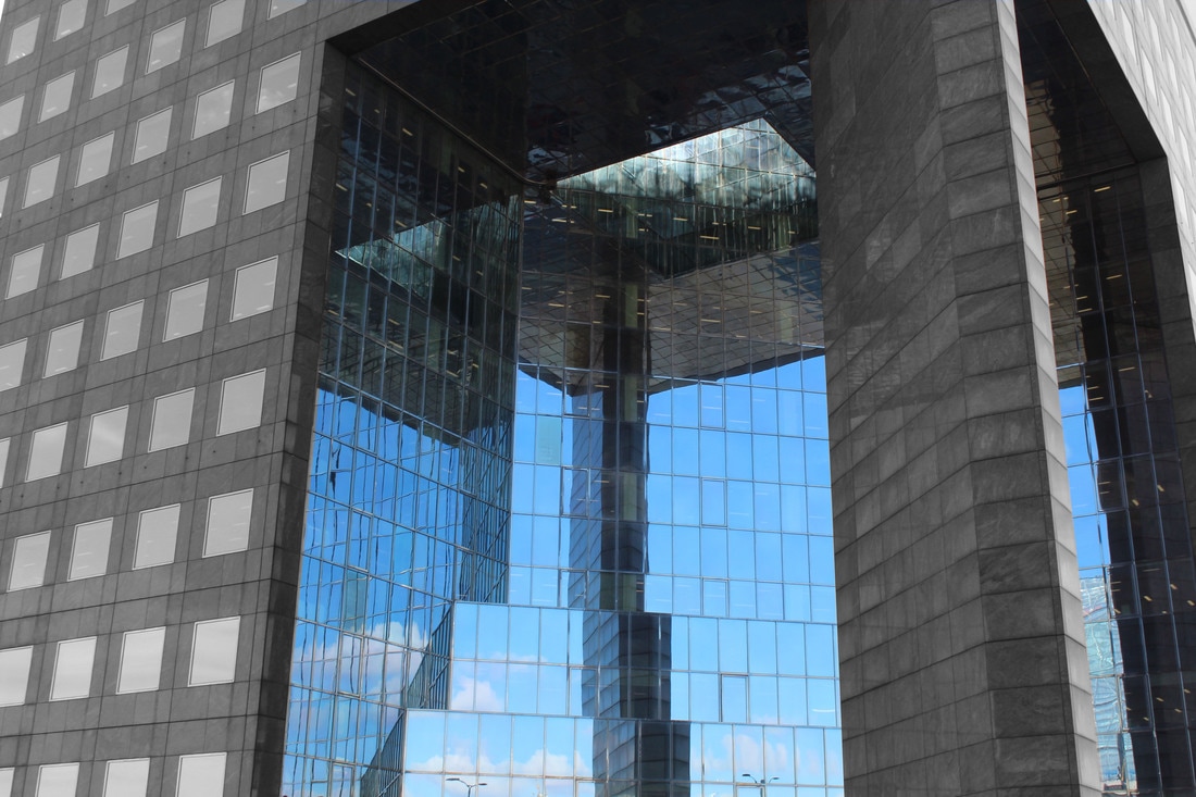
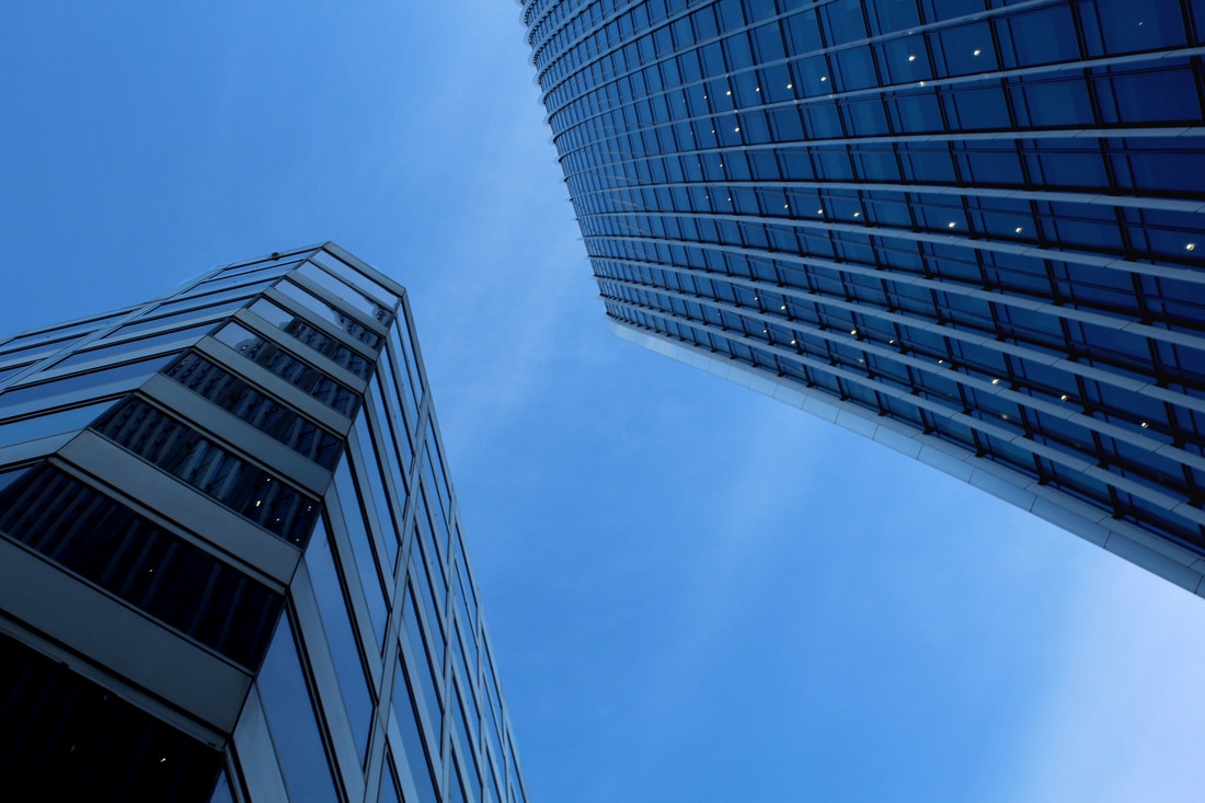
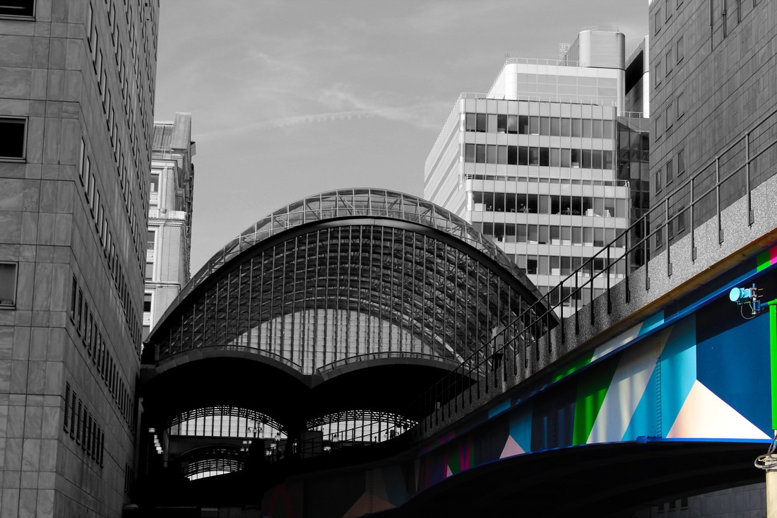
Here are the contact sheets from the rest of my visit to the Tate Modern. We went to the tenth floor and had a chance to take pictures from the balcony. I thought was a perfect time to explore structure from above. The city London has multiple famous architectural sites which people come from all around the world to see. These buildings show structure in a obvious and beautiful way, which i can photograph from all different angles in the future. we then went around the Tate and i came across a small exhibition which i thought represented structure in a different but interesting way.
|
|
|
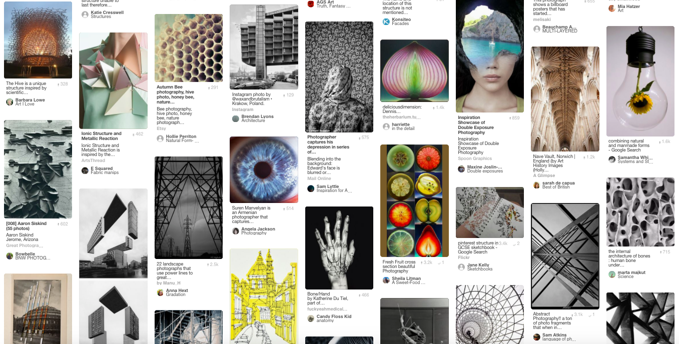
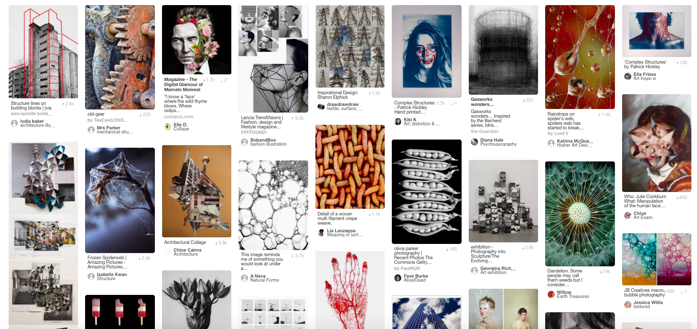
TASK 2: Pintrest board
Using Pintrest i created a bored which consisted of structure, inspiration, photographers work and nature. i found this task useful to find artists and photographers creating projects around the same topic as myself.This could then inspire me and help me further along this unit.
TASK 3: STRUCTURE IN NATURE
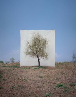
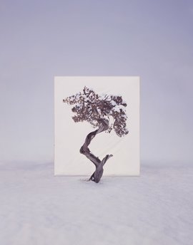
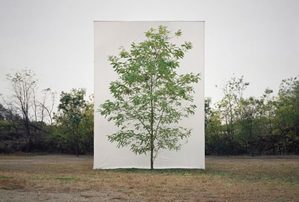
MYOUNG HO LEE
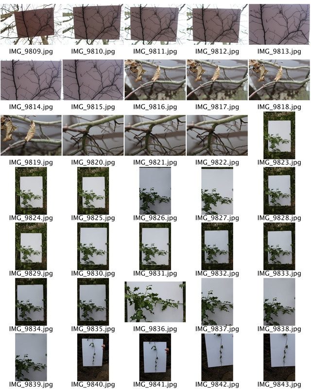
Myoung Ho Lee is a young artist South Korea who has produced an elaborate series of photographs representing the divide between structure and nature. He separates subjects from their original circumstances to derange the difference between subject and image. His work reveals nature by twists and turns, a little fabrication and optical illusion. He enacts his works as ‘a series of discourses on deconstruction in the photography-act’. He uses 4 key concepts so that he can capture the perfect photograph. These are 1 selection of the subject, 2 separation of the subject (this is when he puts in a white background to take away the structure of nature), 3 photographing and 4 conformation of the photograph. one similarity of this series of images is the composition as the main focal point is placed in the centre of the photograph. i think this is effective as although we still get a sense of location, our eyes focus on the main importance and idea of his images.
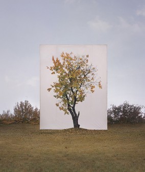
i found this image the most inspiring and effective to analyse. this is because although the tree looks as if it has been printed and mounted on the white background there is a sense of realism in the photographs and we can see the roots and the mount in the ground from the real tree. i found that the distinction of nature in this image was very clear as he has separated the nature with structure almost like man v nature.
|
I thought this image was effective as the contrast between the blue sky and the white square background immediately captures the viewers eye. I also like the fact you can tell that the background is a prop as you can see the wrinkles in the paper, which gives it a less realistic view. The brown and green grass distracts the focus point as it creates an enigma about what time of year the image was taken.
|
This image is slightly different to the other two images as its taken a a different time or year with a different surrounding and environment. i found this eye catching and effective as the white background almost blends into the sky which makes it look as if the tree has been edited alone, and shows that structure has completely taken over the nature factor of the image.
|
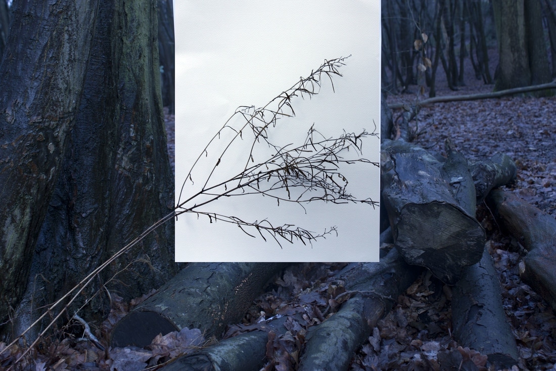
First Response
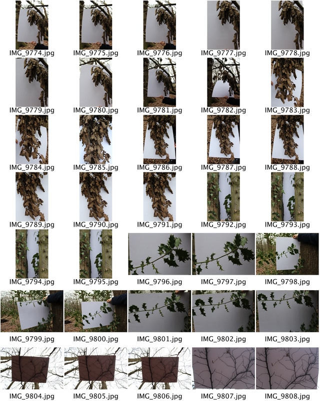
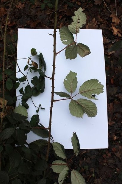
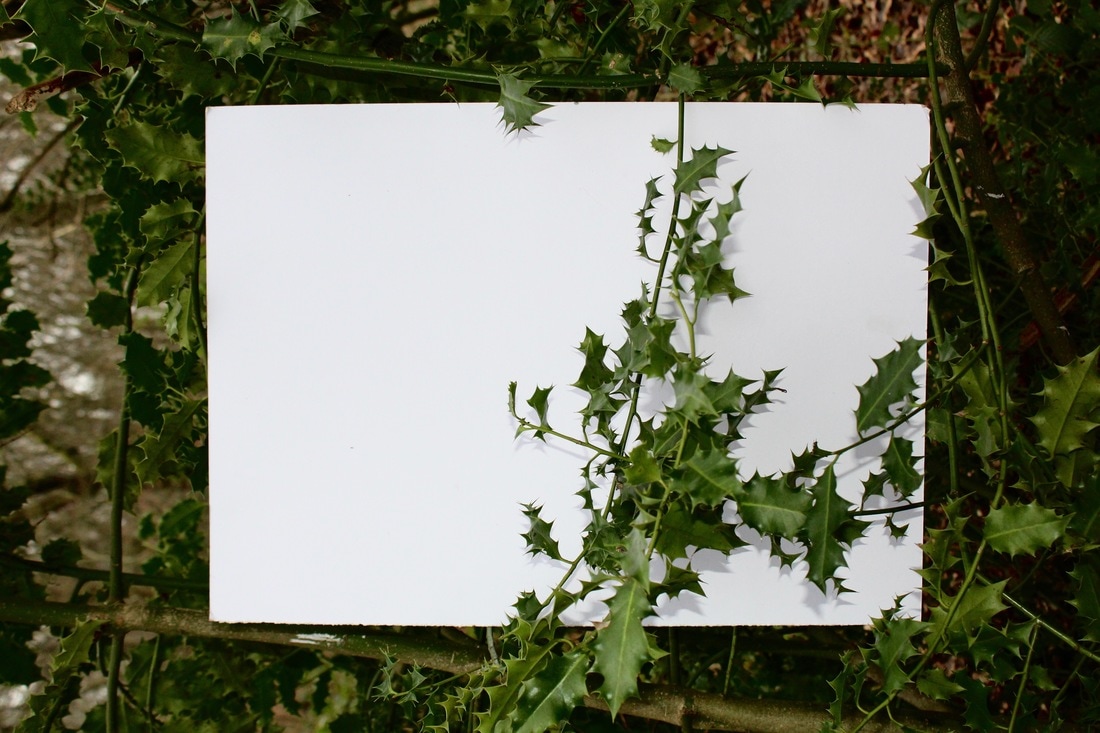
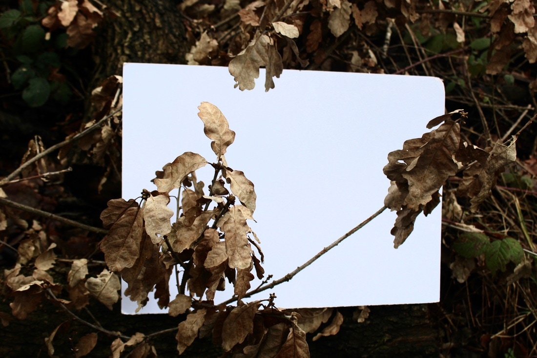
For this first response i used a A3 size of paper and went around the school allotment to find pieces of nature with different textures and leaves that we could photograph on the backdrop. We were restricted with the amount of plants we could use as the time of year wasn't prime time for plants with vibrant colours.
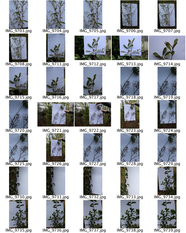
|
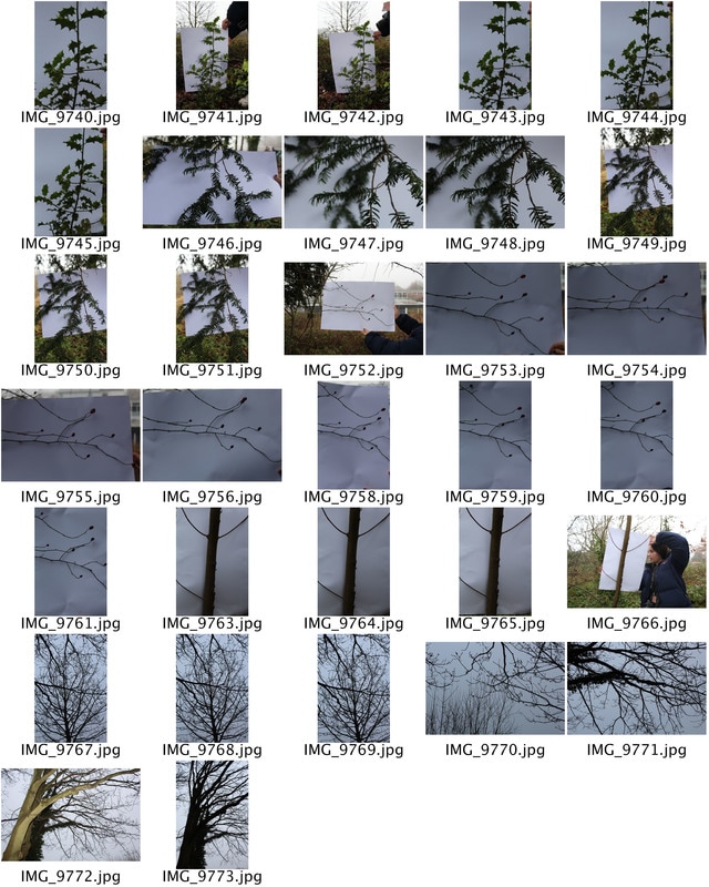
|
We then went to the cold fall woods a five minuet walk from our school to experiment with my textures of leaves and plants. i found this much easier as we weren't restricted to the planets we could used and there were many more options. One difficulty we had was including colour as in the winter the colours in the woods become more brown as the leaves fall off the trees and only the branches are left. Here are some of the images i took:
|
|
|
Selected Images
I chose these three images and decided to edit them using a mixture of adjustments in iPhoto and level and curves in Photoshop so that i could adjust the black points for each image. I thought this brought out the contrast between the white sheet of paper and the plants themselves so that the separation between nature and structure was clear.
|
|
|
These two images show the separation of nature and structure better because i have left a frame around the white sheet of paper so that we could still see the nature behind it and see were the particular planet has come from and we can see its surroundings.
|
|
ARTIST AND ME
Here is a picture to compare the difference between mine and Myoung Ho Lee's work. As you can see her work is on a much larger scale, and i didn't have the facilities to create this large picture scale. instead of using full grown tree's i worked with plants such as branches form trees, flowers and leaves. This still gave the same effect however was just shown and created on a smaller scale.
|
|
SANNA KANNISTO - Artist Link
Sanna Kannisto explores in her photography the theories and concepts with which we approach nature in art and science. In so doing, she uses both the methods of representation in art as well as the methods of the natural sciences. She manages to explore different concepts of structure through her images by using the growth of nature and different types of flowers showing there own type of structure. I think her set up for this particular series of work is effective as it seems as each flower/plant are on a stage being shown collectively to her 'fans'.
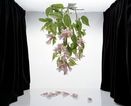
I think the way the bouquet of flowers are hanging upside is extremely effective, it gives a different sense of structure as the gravity is pulling them down and the fallen flowers are laying below which gives a sense of reflection.
|
I thought this image was effective as the plant is abstract and quite abnormal. the bright orange colour of the plant also adds a capturing factor and catches peoples eye. i think the centre positing of the flowers are important.
|
i like the way she has included wildlife animals in her images. Butterflies are such beautiful and majestic animals it brings a sense of magic to the image. the green and purple work well in contrast together.
|
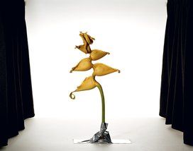
My Response
For my response to Sanna's work i set up similar a similar 'stage' to display the different parts of plants which we collected on. To improve this response i could have used plants with vibrant colours and even used more than one piece at a time. I also could have tried to hide the stand to make the image look more natural and less man handled.
|
|
|
I selected some of the best pictures from this selected and edited the brightness, contrast and exposure of the images to create a surreal and perfect look. i think this made my images more similar to Sanna's as it made them brighter and the detail was much finer once i had finished editing them.
|
|
|
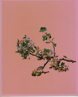
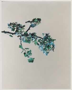
EXTENSION TASK - Diane Beilik 'I am the door'
This work is a collection of photographs of blossom shot over a few years. Some images are made quickly, on location using cheap basic cameras. Others are carefully constructed in a studio using blossom cut from trees in bloom, left to wither then painted and suspended in an artificial blue sky.
|
|
Using branches and plants collected from the first nature task use the techniques that are shown in I am the door and create a series of unique visual representations of nature. Experiment both with digital cameras and colour film to show different experimentation and developments.
My Response
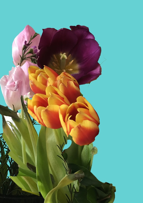
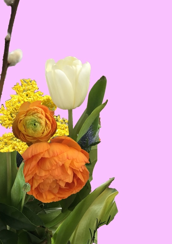
I used these 8 different bouquet of flowers to edit my pictures with. i tried to capture a range of different colours and types to make the final outcome look more intriguing and eye catching,
Here are my two responses to Diane Bailie's work. To make my response match her images more accurately i should have printed out the images and painted or bleaches the flowers to make them look more derelict and 2d.
|
|
TASK 4: VISIT AN EXHIBITION
Wolfgang Tillmans
Wolfgang Tillmans is a german fine-art photographer. His diverse body of work is distinguished by observation of his surroundings and an ongoing investigation of the photographic medium’s foundations. This exhibition brings together Tillmans works in an exciting variety of media – photographs, of course, but also video, digital slide projections, publications, curatorial projects and recorded music – all staged by the artist in characteristically innovative style. I think his work is interesting and capture your eye with the different bold colours and textures.
|
The different types of work are all shown on these contact sheets. Tillman varies his work between colours, textures and the way the images are staged and presented. i think this is effective as it shows his talent and creativity in different ways. for example, The 3rd 4th and 5th image on this contact sheet shows a pixelated background formed by many miniature lack white and a few green squares. this shows texture and also simplicity at the same time as although the pattern is complex it repeats itself. One image which contrasts with this work is the smooth ombre sunset at the bottom of the second contact sheet. this image shows building up of colours and also makes your feel calm unlike the pixelated photo.
|
Favourite Images
I think that this image is effective as it combines abstraction and the lack of a structure to capture the viewers eye, as the image looks 'wrong'.
|
These two images are very similar however the difference in colour between them make them seem so much more different and unique.
|
This image was my favourite out of all the photographs in the exhibition. i found the structure amusing as it creates an illusion as our eyes see the piece of folded paper and think that it is coming out of the frame however the image is 2d. The composition of shadows and light throughout the image is also important as it creates the texture and the feel of the image. The main focus point of the photograph is inside the paper as it shows us a different view from the rest.
|
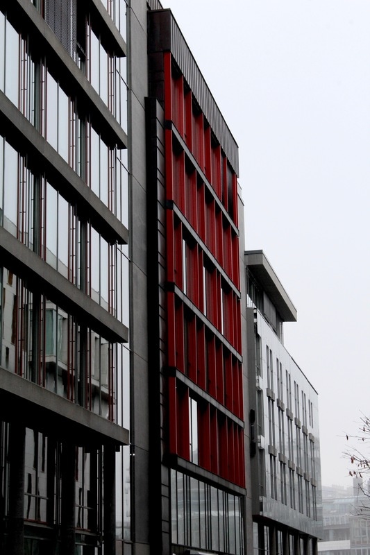
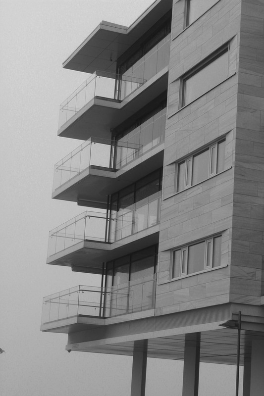
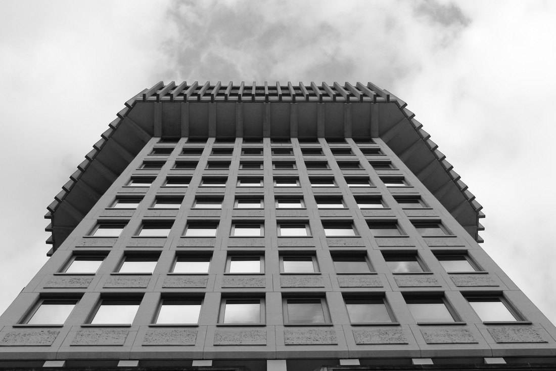
Structure of buildings in Norway
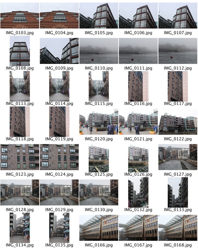
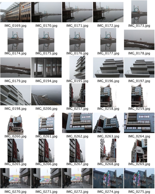
First response - For my first response i took modernistic pictures of architecture in Oslo as i was away when the task was set so i was not able to take pictures of typical brutalist buildings. i found that the structure of buildings were much more modernistic as the architecture in this country has just reached a peak and there are many young architects experimenting with new modernistic buildings. whilst i was taking photos here i was still looking for any brutalist buildings and was lucky as i found one however out of the buildings were new and modern.
|
|
|
|
|
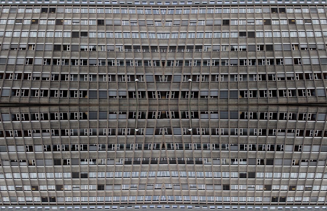
The photograph below is one of the brutalist buildings that I visited. I think that the building was effective as it combined both the structure of the building in two ways, the first being within the construction of the building and the second being the social structure of the area I was located. The building was combined with vertical and horizontal lines that often symbolise order. The image can be said to portray, order within chaos, as the council housing displays equality within the structure of society yet the building itself examines how easy order is to create in a physical sense. The image further alludes to how society conforms more to physical order than can be seen, rather than mental structure that needs to be further managed.
TASK 5: STRUCTURE OF BRUTALIST BUILDINGS
HISTORY:
The term Brutalism was derived from the French ‘Béton brut’, or raw concrete, was a term coined for the futurist architecture being created by Le Corbusier and others like him. From this label the term Brutalism was created as a way to classify this style of architecture.The expression became associated with a movement emerging in postwar British architectural offices. The architecture itself is characterized by the large size of the buildings and the use of raw unfinished concrete. Brutalist buildings also make use of geometric forms in a way to attempt to communicate the buildings function and what the rooms behind the slabs of concrete are used for.
"The city’s changing architecture is a kind of memorial of humanity’s endeavours and schemes, for all buildings have been fashioned according to the ideologies of their days". - Le Corbusier
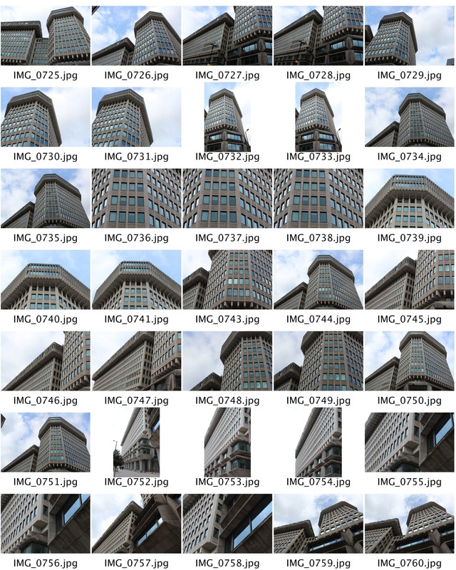
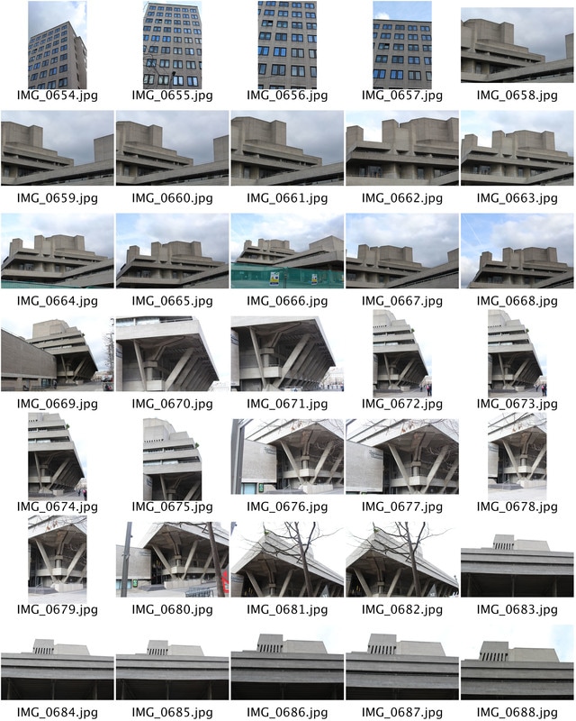
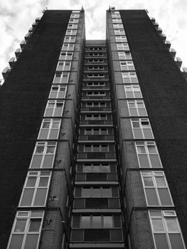
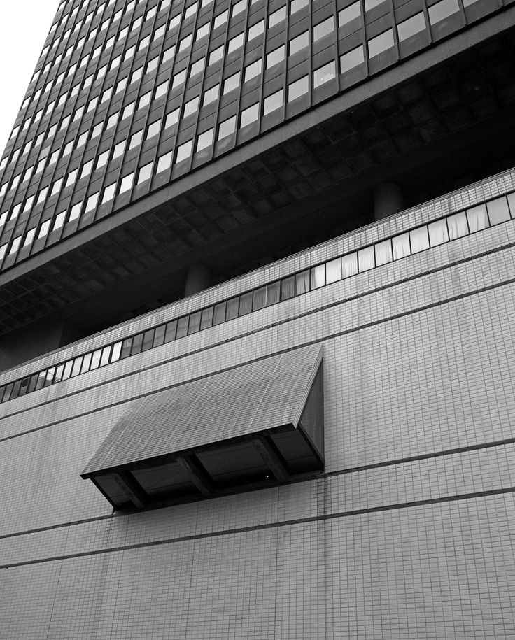
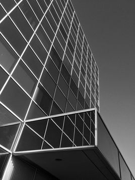
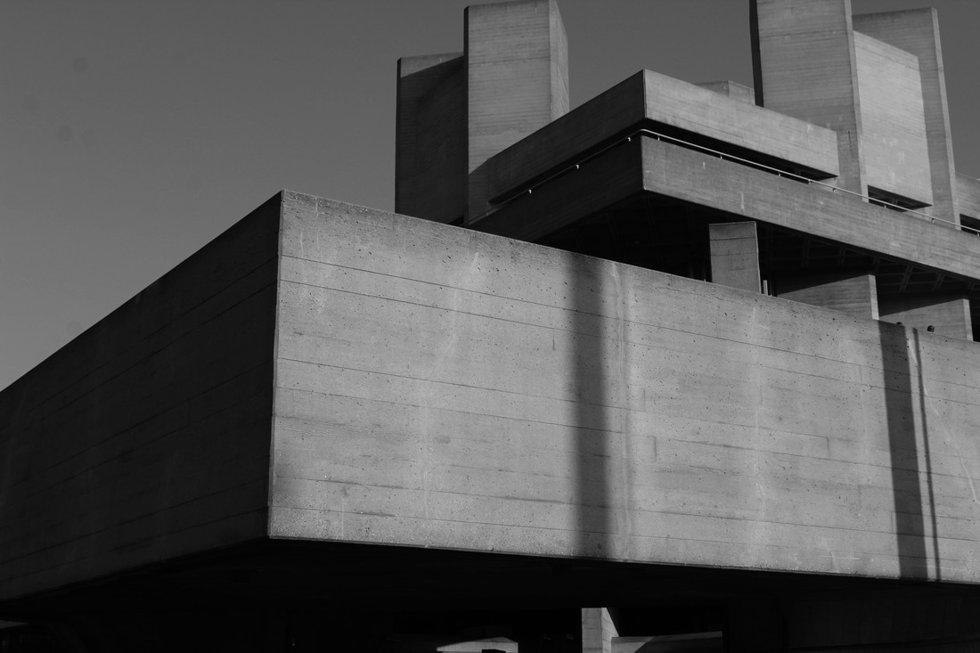
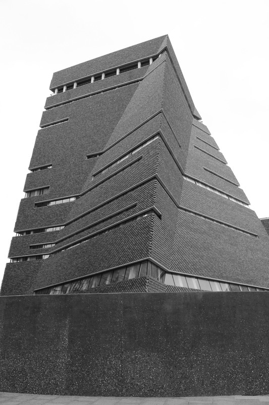
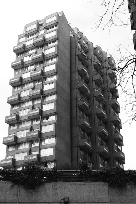
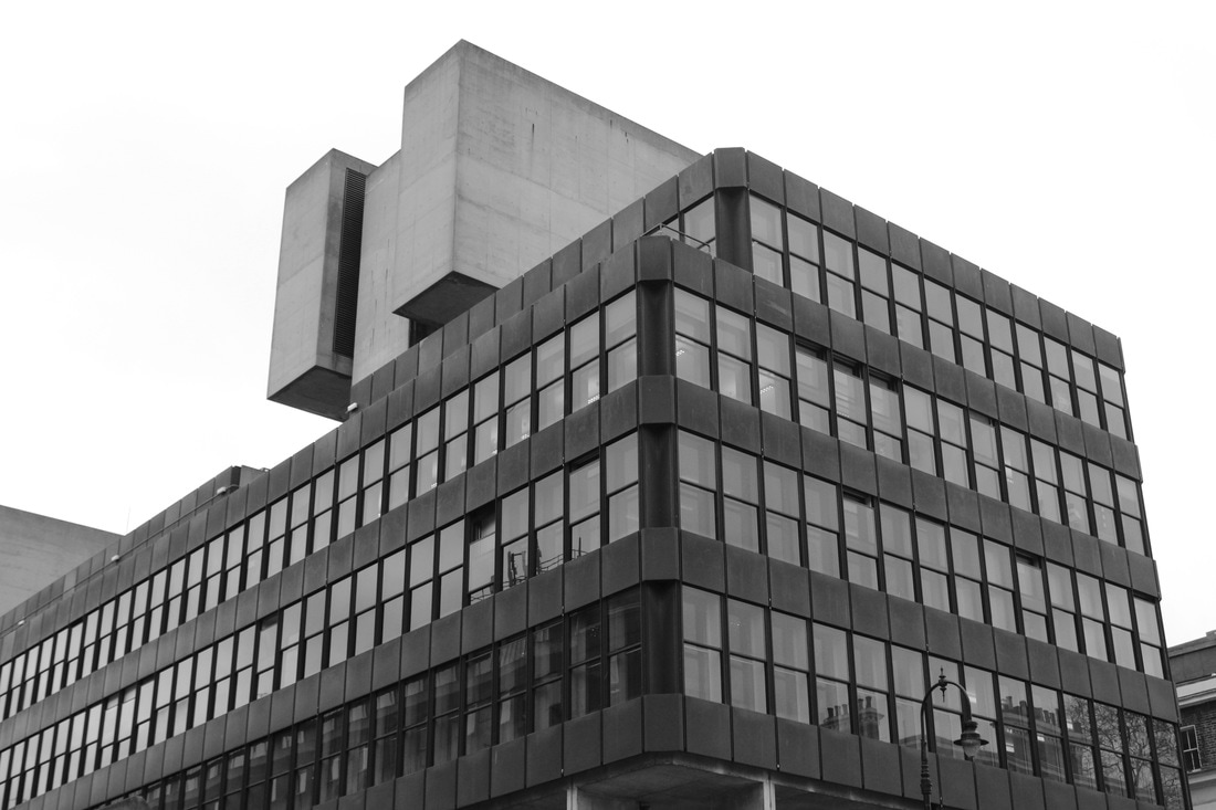
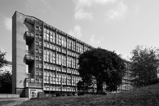
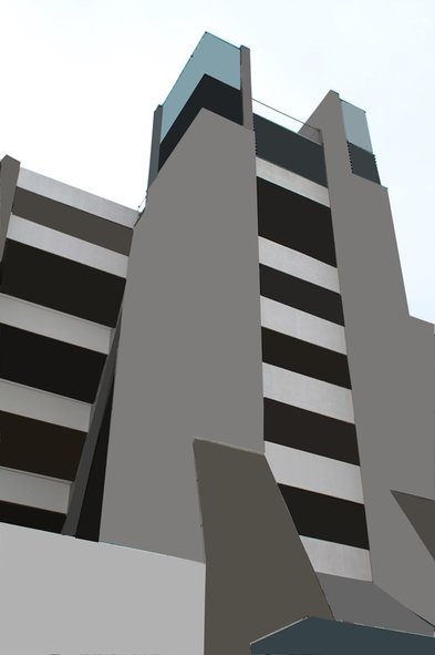
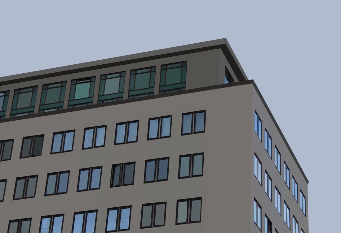
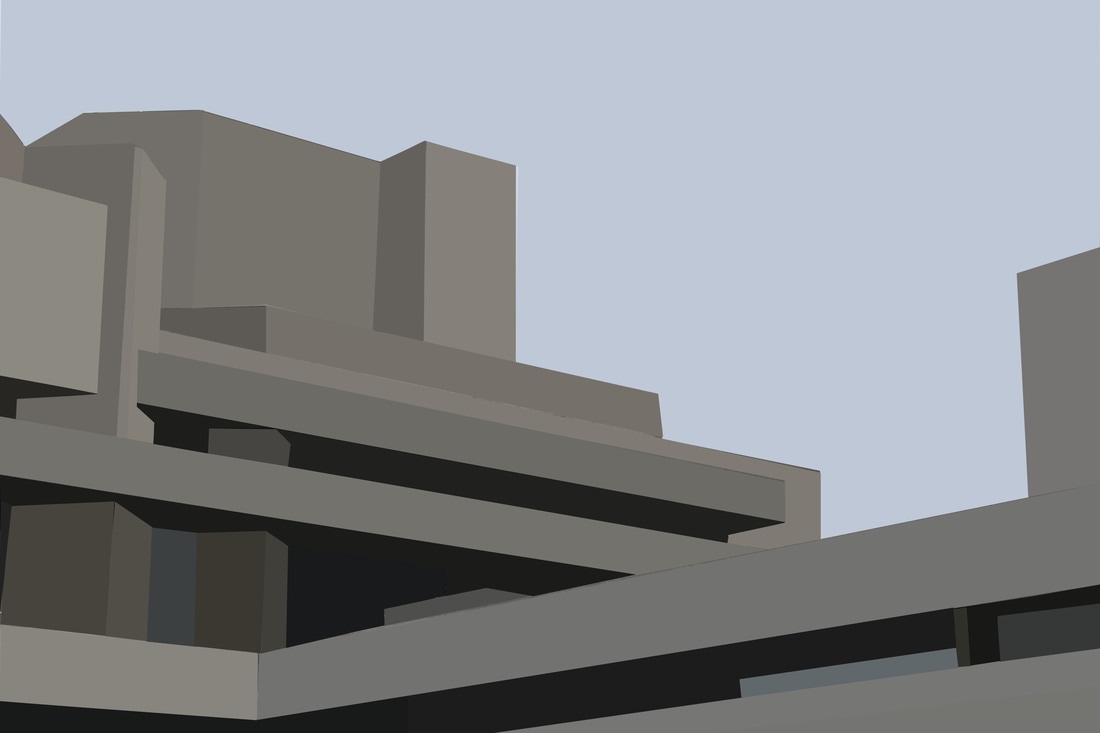
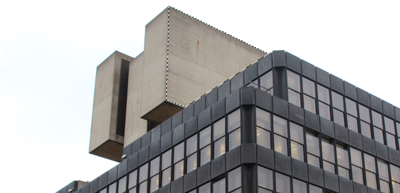
Brutalist buildings in London
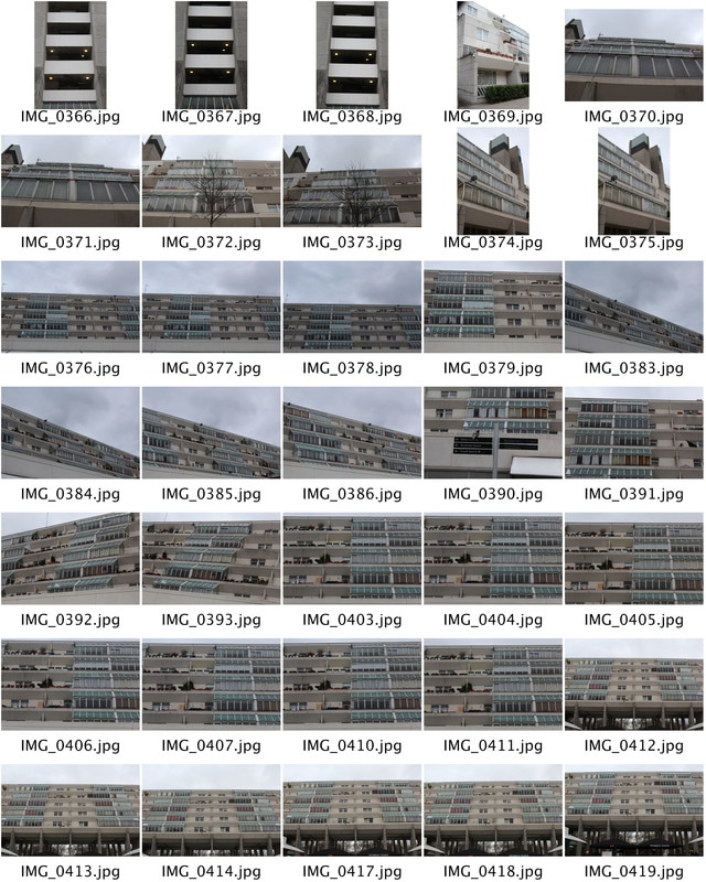
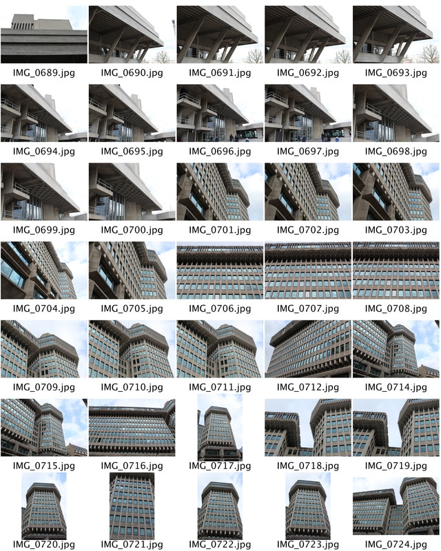
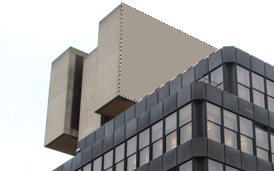
Second response- For my second response i took photographs at 4 key brutalist locations in London. i went to The Brunswick centre and found that the different layers of balcony's in the building was effective as the glass and the white brick created a modern effect. i also went to The barbican... the Southbank centre complex and national theatre... and lastly i went to the ministry of justice ...
|
|
|
|
|
|
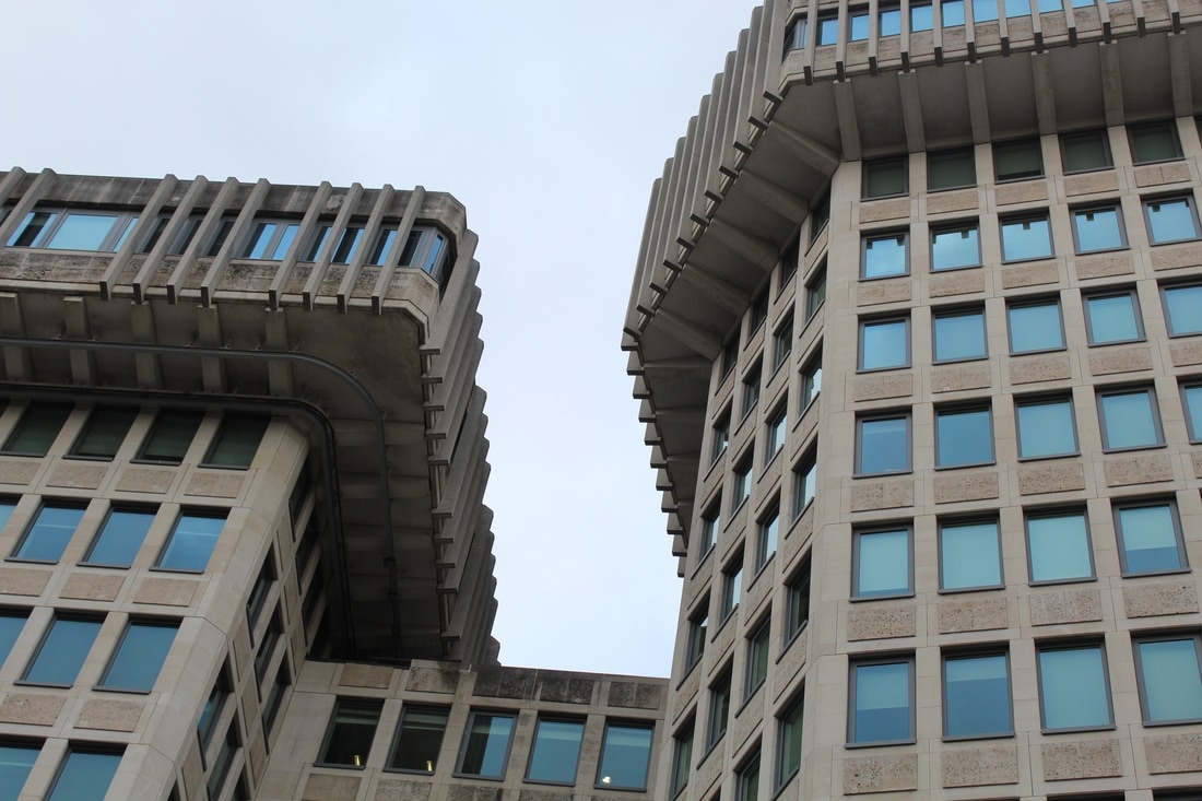
Ministry of Justice
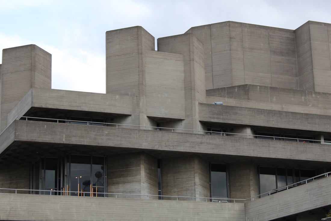
South bank Centre
Brunswick Centre
Simon Phipps - Artist link
The photography by Simon Phipps provides a unique perspective and portrays Brutalist architecture in a sensitive, realistic and distinctive manner. Phipps has spent the last 15 years photographing and documenting Brutalist and buildings in the UK, creating a survey of photographic images that demonstrate the breadth of this contentious architectural style.
|
|
|
Phipps's are photographed from the same or similar perspectives. this makes his work original as the audience will recognise his work when they first see it. I think the scale presents these buildings on is big as it is taken from worms eye view allowing them to look more in power and much larger.
My Response
|
|
ARTIST AND ME
Here is a photograph of simon's work and one of mine. i have put these two images besides each other so that you can compare the differences within our work. such as the different angles and variety of objects in our images.
|
Simon Phipps work
This photograph was taken by Simon Phipps. T he way he has capture the long/wide brutalist building is effective as we see the scale of the building compared to trees which makes the building look bigger. The way he has captured the image lets us see more of the surrounding.
|
My work
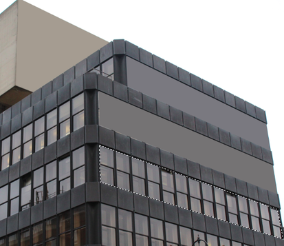
I photographed the ministry of justice brutalist building fro a worms eye view as i thought that this would only capture the true scale of the image. i also though that the image in black and white created a contrast between the windows which was more effective as it brings out the detail in the building.
|
Overall, to get my response more like Phipps i will photograph my brutalist building from a landscape perspective instead of a worms eye view. i will also try and include more vegetation as i think this brings a more wildlife and brutalist factor to the image.
Extension Task 1 - Thomas Danthony
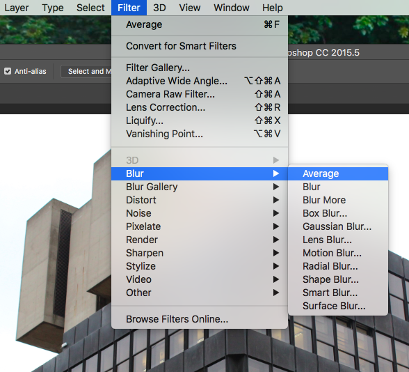
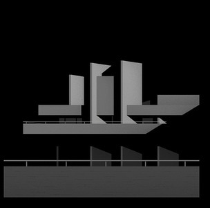
Thomas Danthony is a french artist based in London. Often narrative, Thomas's work is characterized by a clever use of light, bold compositions and a dose of mystery. The Brutalism project is a collaboration with black dragon press about Brutalism architecture in London. He turns photographs that he has taken in to simplified images in Photoshop and then in turns creates screen prints of his creations. This creates an unrealistic factor to the image witch is effective as it brings in a cartoon effect.
|
This video shows a variety of the different brutalist buildings which's details have all been simplified and edited in photoshop. Tp create his unrealistic shadow look he fill in different shapes and sections of his image in solid colour so there is not reflection of light or shadow were it is not needed. This is what gives it its unrealistic look as it is almost like perfection.
|
My Response
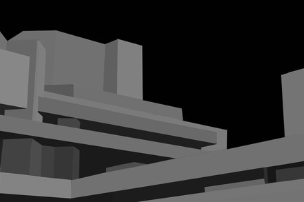
This process required patience and precision, i found that zooming into the image helped my accuracy and created a much better and neater final image. i think that my technique got better towards my last two edits as i concentrated on alining the polygonal lasso tool perfectly with the image itself. i decided to keep the colour in my images as i thought that the contrast between the greys, the colour will add a sense of excitement.
|
|
Process of construction
1. Open up your brutalist building into Photoshop. First select the Polyganol lasso tool from the bar menu.
|
Then using this took select a part of your photograph with similar colours and a solid shape.
|
|
Once you have blurred this section of your image. redo these steps for each shape with different shades for the rest of the image, as seen on the right.
|
|
ARTIST AND ME
Here is a comparison between my work and Thomas Danthony's work. i think i succeeded at the right idea and concept on creating a similar piece to work as his. However i used an average tool which may have decreased the contrast in the image, whereas if i selected the right fill colour i could have achieved a much more bold piece. I found that the building you edit is the most important factor for creating work like this. It should have straight clear edges and no curves or spheres. This will allow you to capture and edit the image more precisely.
|
|
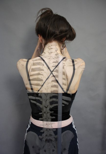
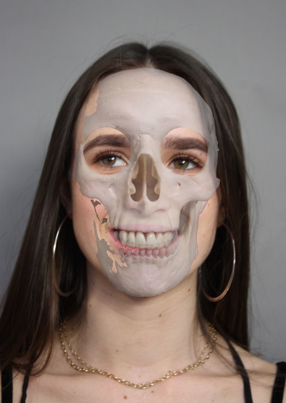
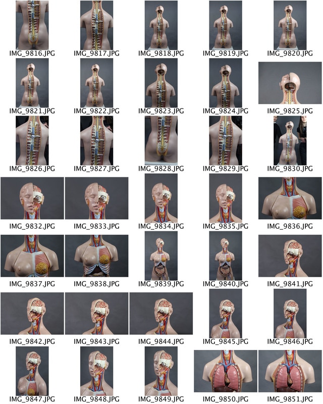
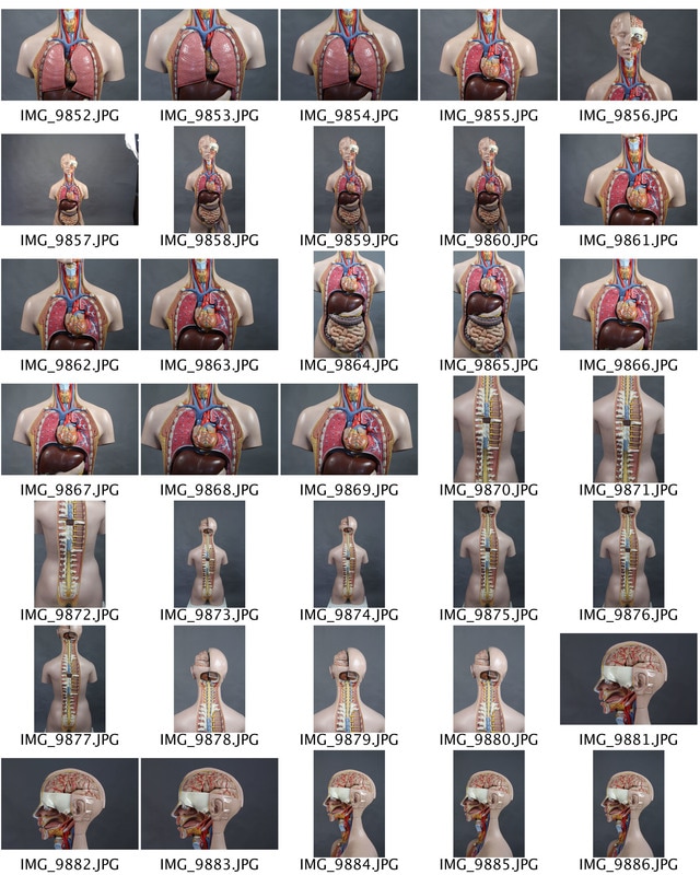
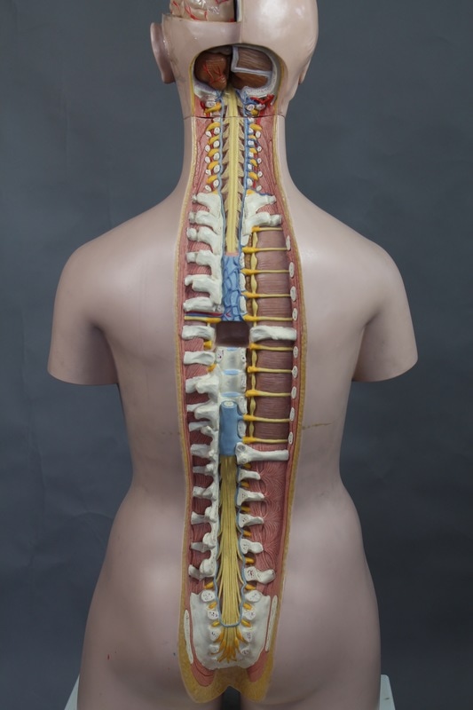
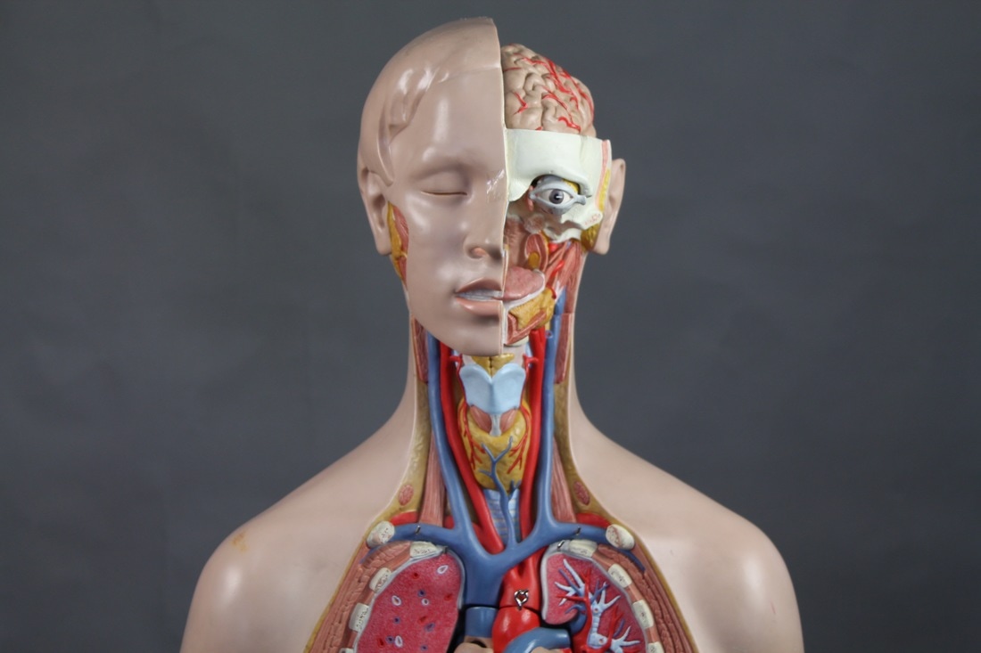
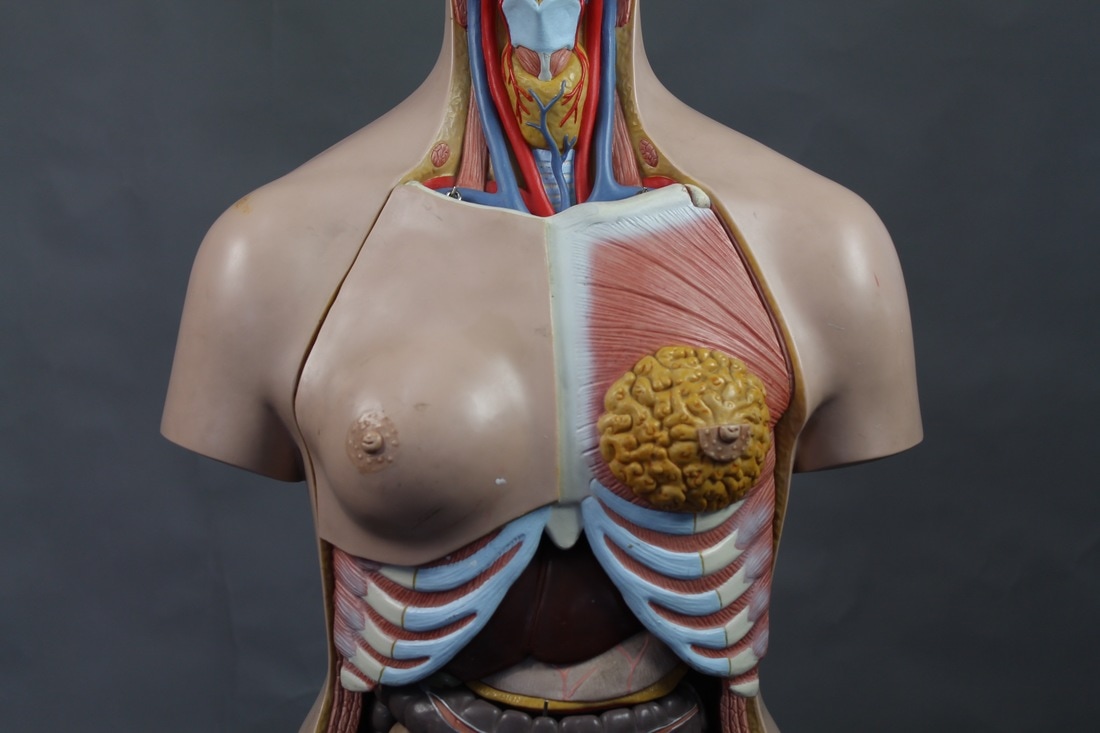
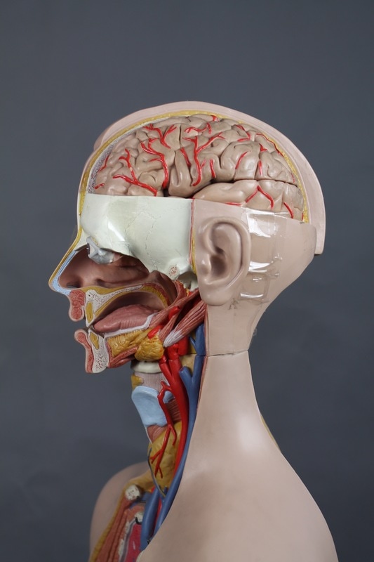
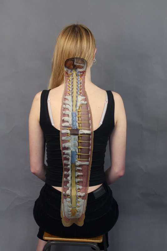
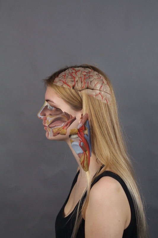
TASK 6- STRUCTURE OF THE BODY
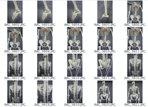
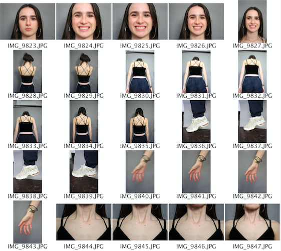
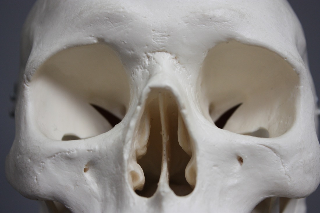
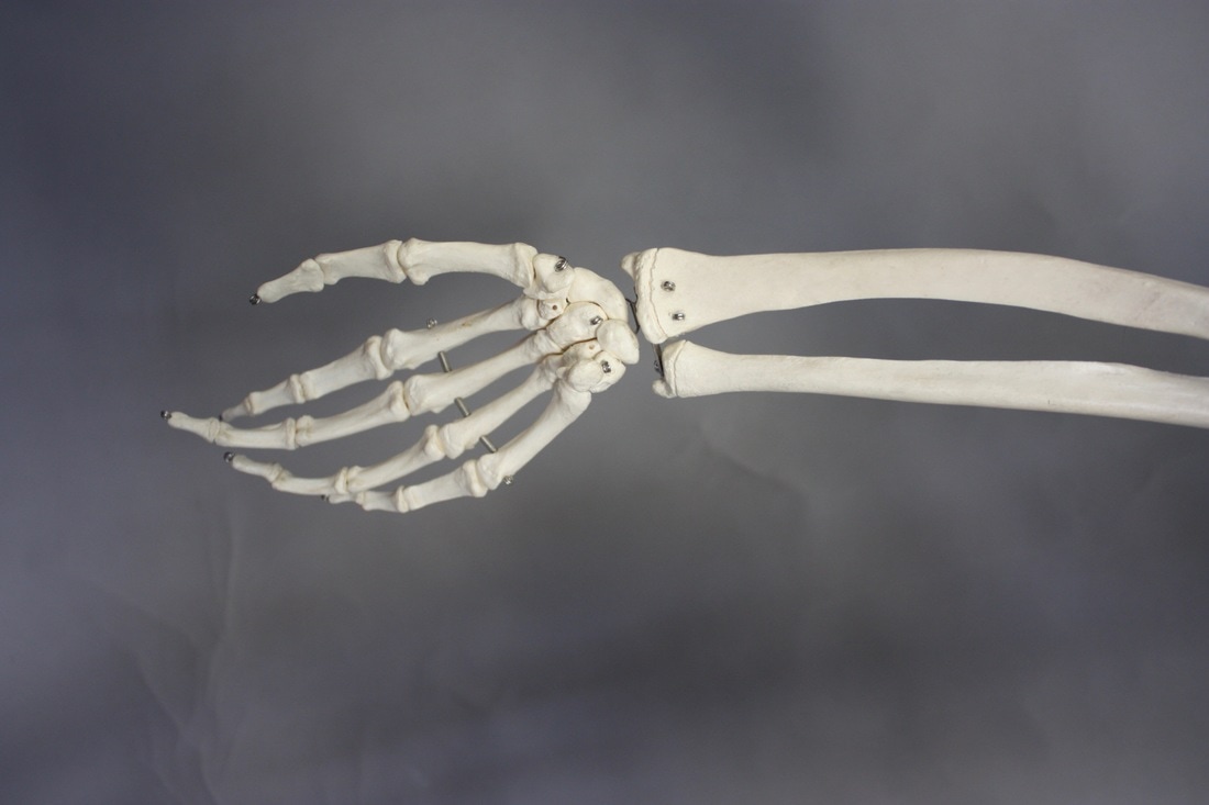
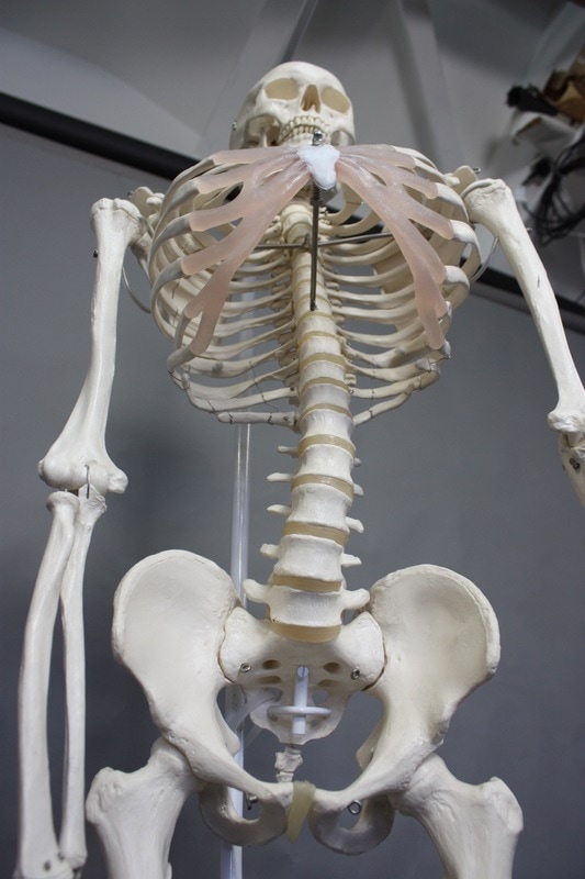
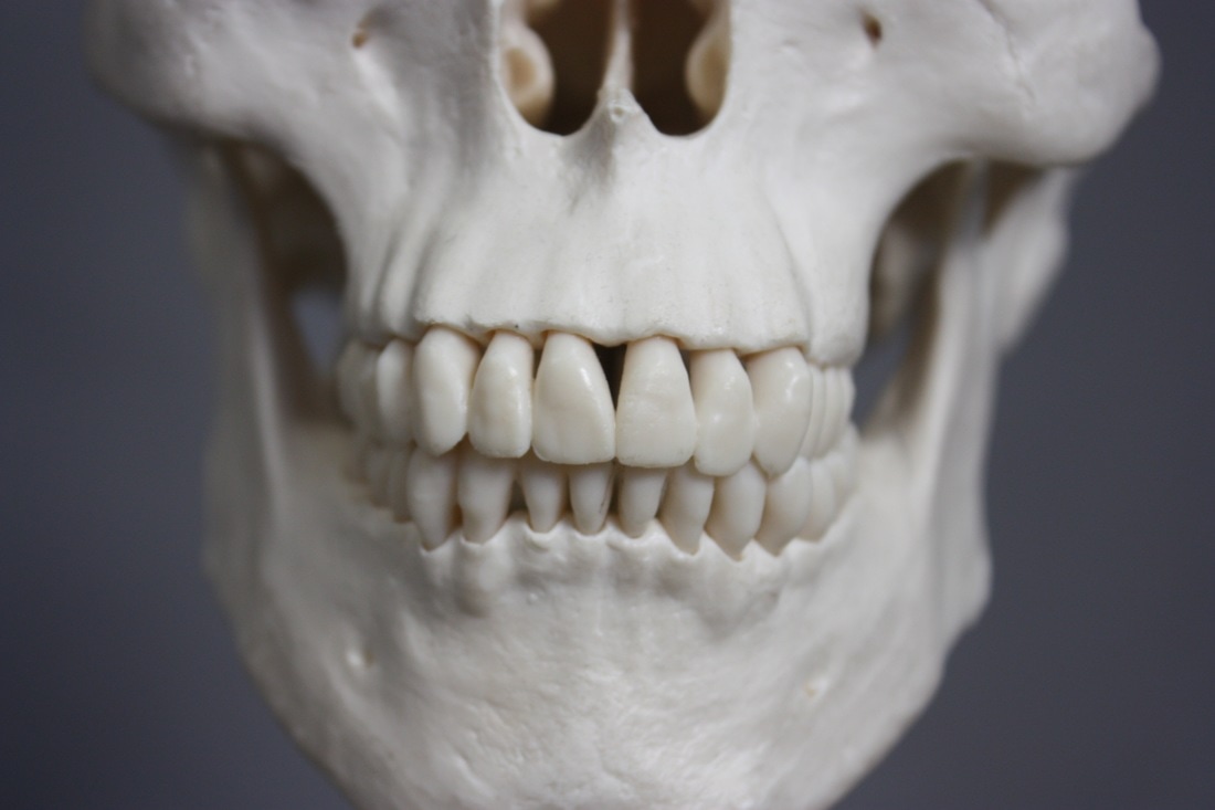
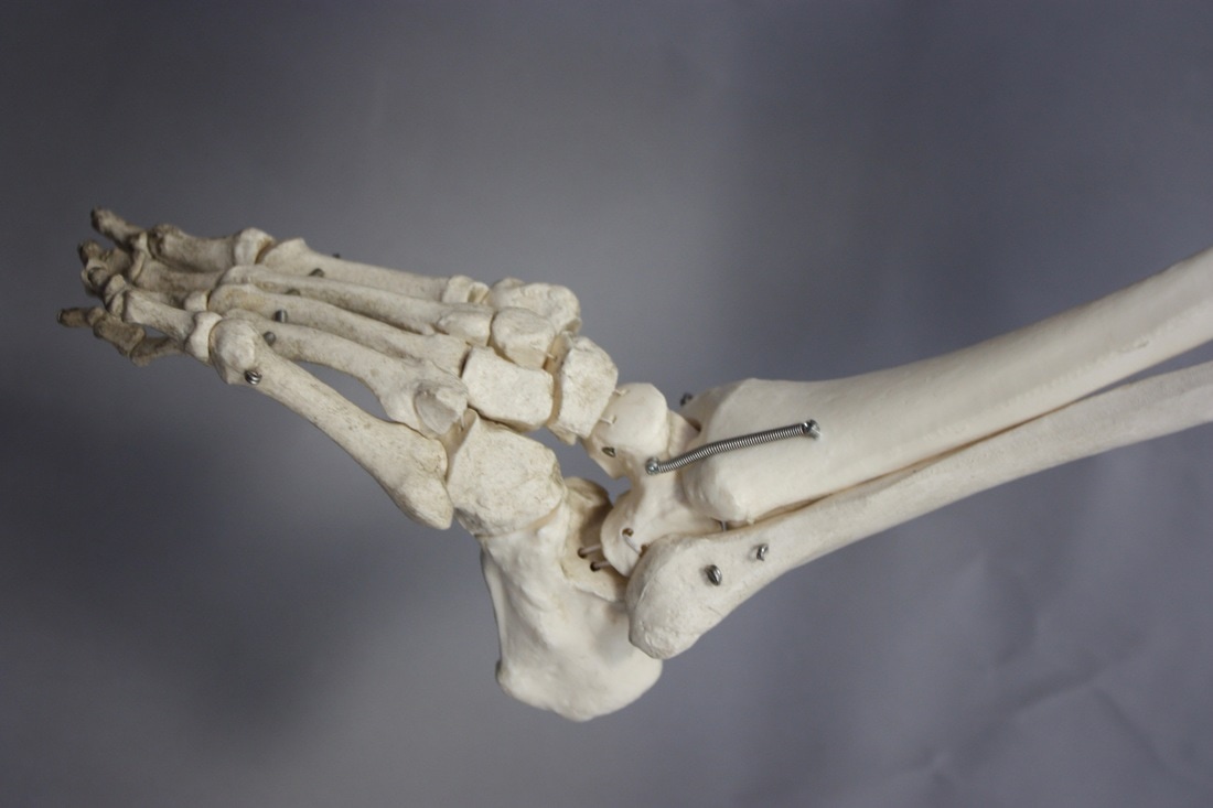
The body is made up of multiple layers and has an amazing complex structure. Many artists have investigated the different parts and layers that make up this unique structure. I think that photographing these different body parts on both a skeleton which shows the inner structure and on a real human which shows the outer structure and combining them can create another complex structure with lots of different layers again.
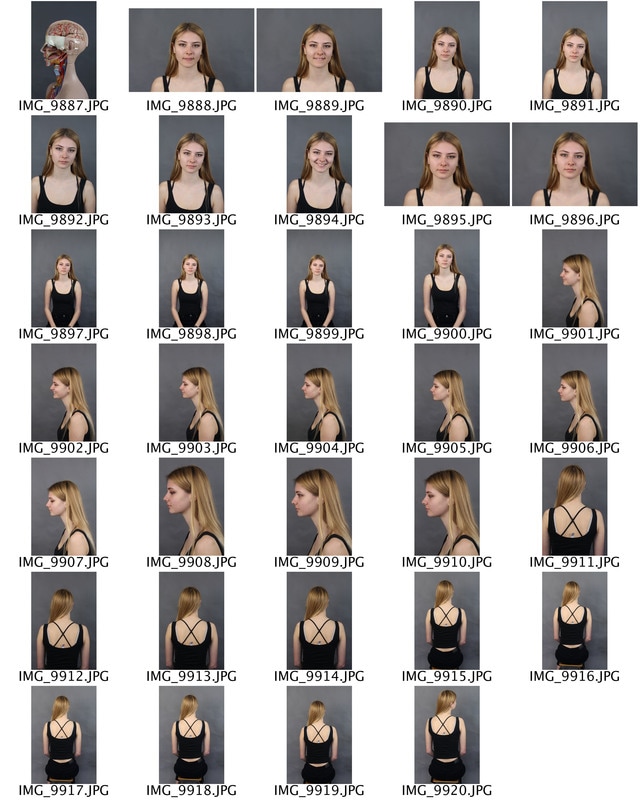
First response
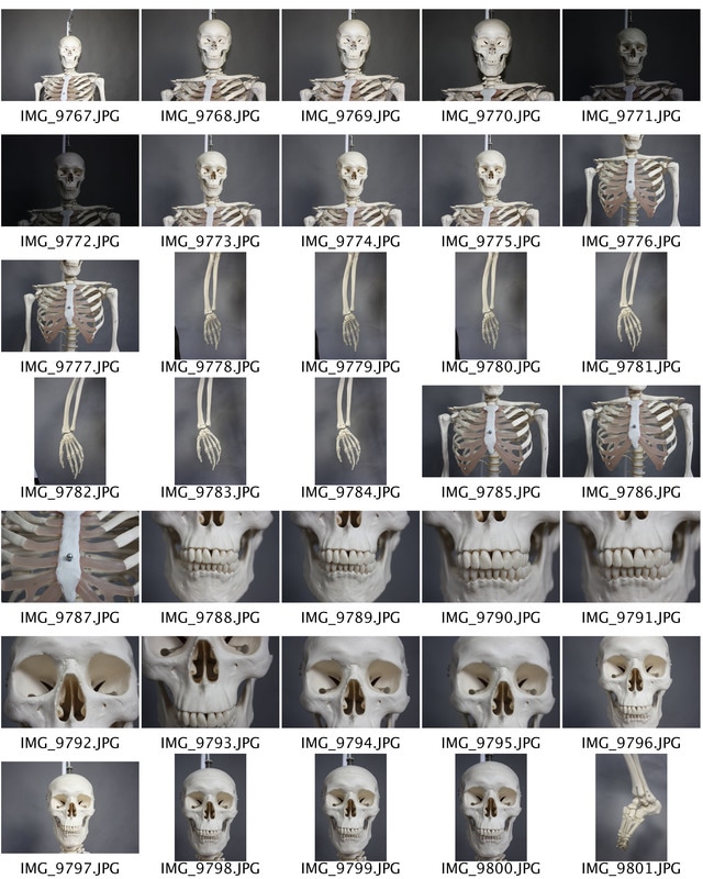
Here are the contact sheets showing different angles of both a skeleton and a real person. i used these images to try and combine them and changed the opacity so that it looked as if these were her actual bones. i took picture of different parts of the body so that i could focus on the detail of the structure much easier.
|
|
|
|
|
For my first response i experimented with simple images and just overlaying the two images and changing the opacity. This was a simple process however it work quite difficult to capture the image form the skeleton and the real life person from the exact same angle as it was difficult to line them up equally. i also only used photographs from straight on as i thought this would be easier to try and edit for my first few images. I then moved on to more skilled work, where i changed the angle of both models, and tried to line then up perfectly.
|
|
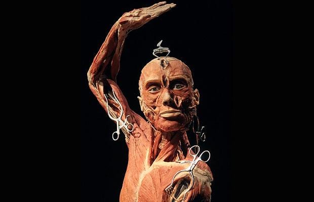
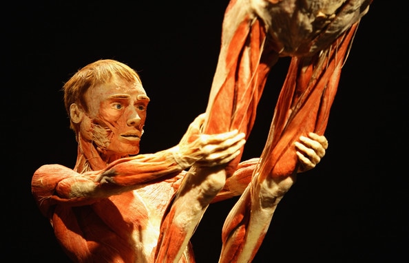
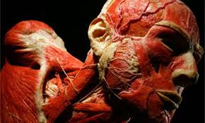
Artist link - Gunther von Hagens
Gunther von Hagens Is a German anatomist who invented the technique for preserving biological tissue specimens called plastination. What is plastination? It started 25 years ago when Von Hagens, using polymer chemistry, pioneered a preservation technique that replaces water in cells with plastic material. By 1990, he had plastinated his first whole body - a process that requires 1,500 hours' work and costs up to £25,000. The result is an odourless, dry, realistic-looking corpse that endures. His sculptures present the internal organs of the body as if a open body was in front of the viewer, and displays the structure of the body depicting how it works and flows together as one.
|
|
|
His work is interesting as it is controversial which creates discussion and often confusion. Exhibits like this help people more closely connect with their own body and the control they have over it, it can only help reverse some of the negative trends we are seeing in society today.
Second Response
For my second response i decided to capture the skeleton from selection of different angles and concentrated on certain areas. I then used the select tool to select different bones from my images which would create more detail. I also found images online which showed muscles structure, which i thought would add more realistic values to the image as would create more layers of structure and show the reality of the body.
|
|
|
I photographed the same muses and flesh structure from different angles and shot close ups of certain parts of the body such as the brain and chest. I thought this model was perfect for this task as it had various layers which showed different structure of the body and you took of each layer.
|
|
|
Here i edited the image from the muscle structure onto the real life model. i tried to fit the pieces together so it looked more realistic however i found this difficult as the sculpture had a very different shape to the foil i was editing. i also lowered the opacity so that you could see here the image was meant to fit.
|
|
3 STRANDS
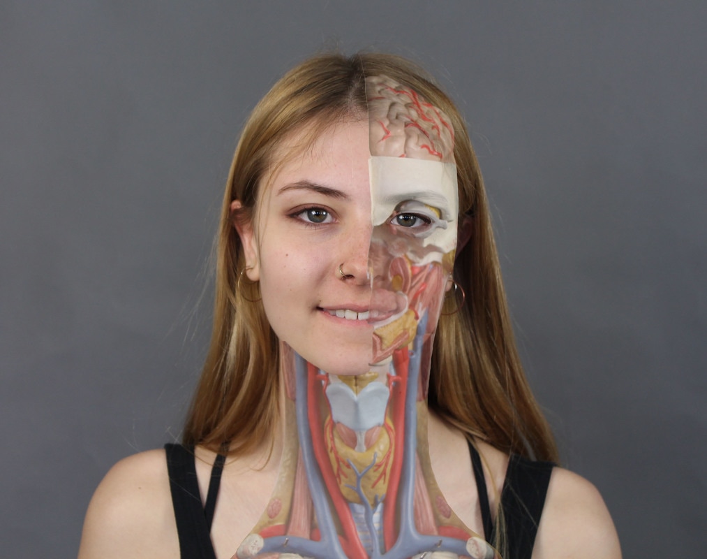
STRAND 1 - Distortion of Facial Structure
I think this strand will be interesting and intriguing to explore. I find the separating of structure interesting and in this strand i will be separating structure and creating a new more complex one.
David Samuel Stern
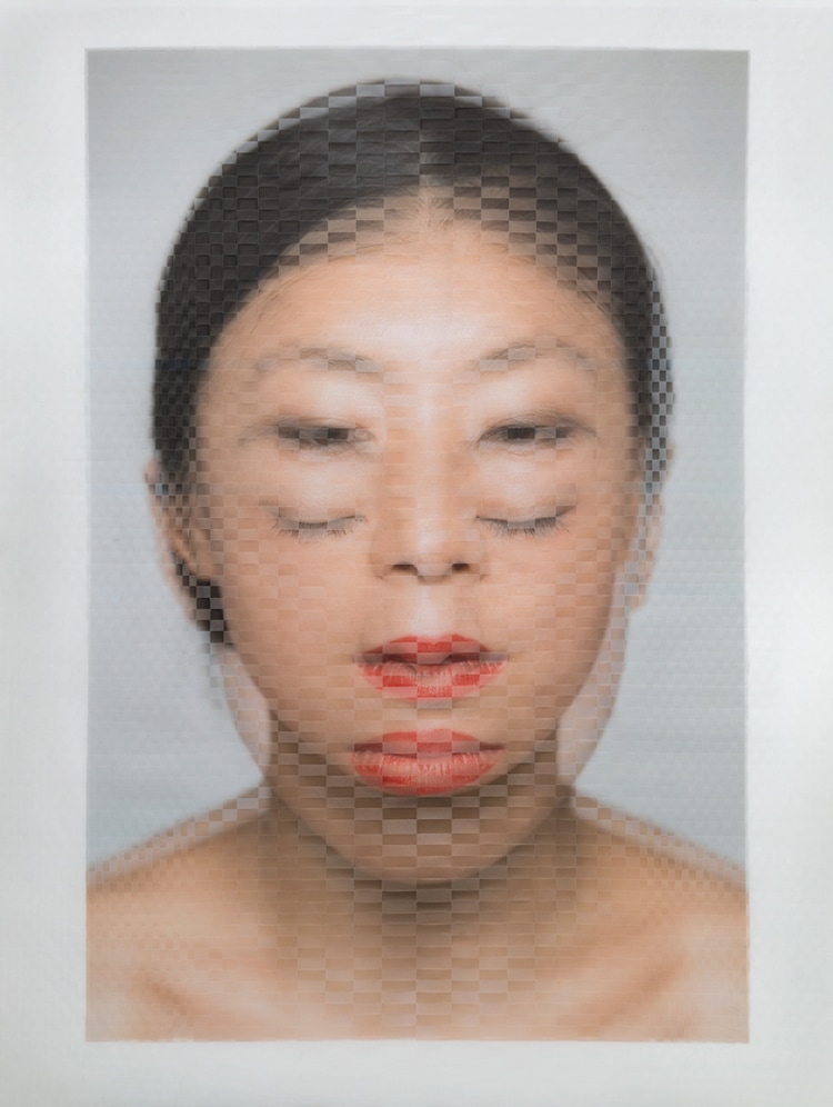
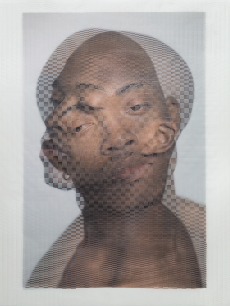
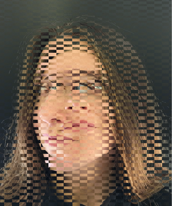
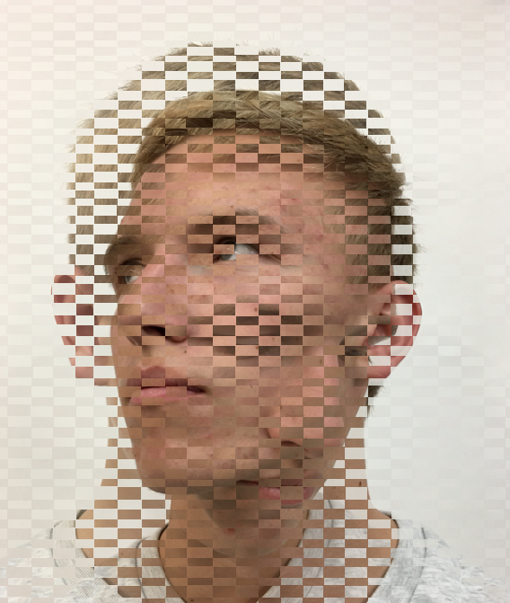
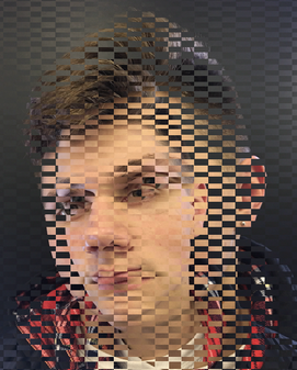
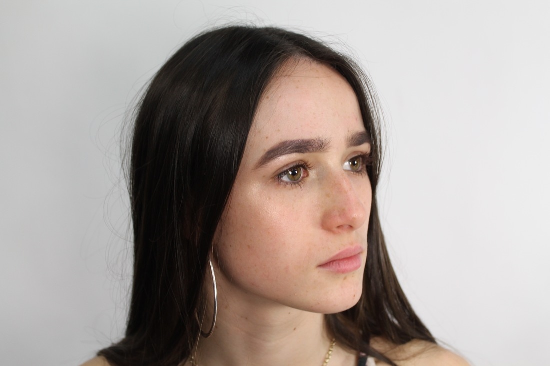
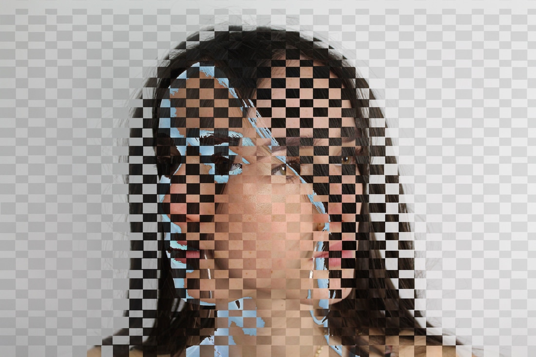
Brooklyn based artist David Samuel Stern takes still photographs, and fuses them together so that they appear to be in motion. He begins by taking two portraits of the same person, and then carefully and meticulously cuts them apart before physically weaving them back into one another. This not only creates amazing texture and an interesting checkered pattern, but combines physical features until the composition.
|
|
|
These images are the result of physically weaving together two photographic prints of the same subject. They are an attempt to bridge dignified, direct portraits with a sort of abstraction that allows their subjects to hide within themselves, and the photographs to be distinctly physical objects. In hiding some things, we reveal others. With a light and airy palette, these breathtaking photographic prints become ghosts of themselves, two versions or the same person. Two different emotions are often present, creating an interesting dichotomy of the internal character. We are seeing two sides of the subjects, as the weaving alters and skews our perspective. Stern’s highly original technique abstracts the portraits so that they seem to be caught in mid motion. Both original images become blurred after they are combines by weaving. The once crisp photographic prints are transformed by their alteration, creating a painterly atmosphere. David Samuel Stern’s method is simple yet powerful, exposing two sides of each of his subjects. However, the abstraction present in his work also hides elements and details of the portraits as well.
First Response
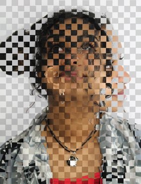
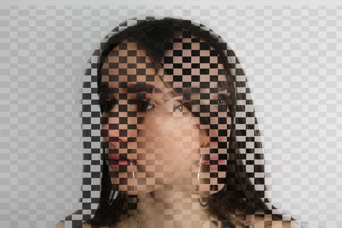
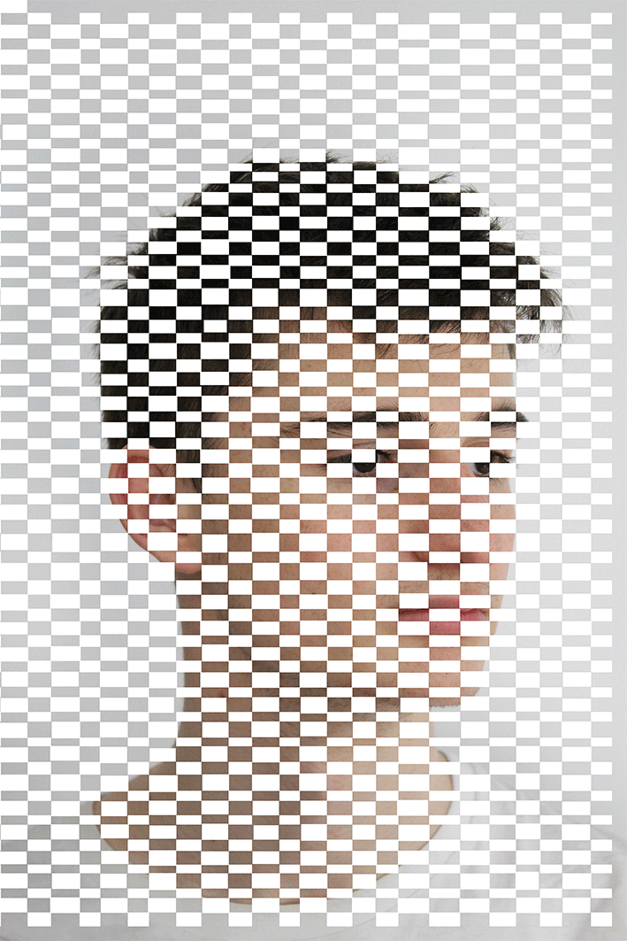
For my first response i took a series of photographs of people from my class with their body straight and got them to move their head so that they were facing forwards left, right and upwards. This would then show the two different layers and positions once i started to weave them. i like the way the fading effect is seen through the movement of the people may correlate with how as a person ages, memories fade and are forgotten, and this can literally be seen as they are losing a part of them.
|
|
The images below were my 3rd 4th and 5th tries which is obvious in the quality of the edits. i preferred these images as i feel they looked much more tidy/neater. i think this is because i experimented with a different tecnique on photoshop which took longer however allowed me to be much more precise with my work. i also Selected a more rectangle shape to erase from the first layer as this made the response correlate more to Stern's work. I think that this worked a lot better as they look more distorted.
|
|
|
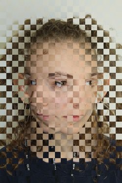
Second Response - Edits
For my second response i used photoshop to edit 3 different versions of the same photograph. I thought that by adding colour and different textures to the image it would build on the idea of structure and adding more layers to the images also meant that they have a more complex an interesting one.
|
|
|
The three images above show how the structure started and the end result. I think that having the model face two complete different directions had a nice touch to the end image as it creates a sense of movement. i like how the hair and her skin contrast together as it shows off the weaving technique much clearer.
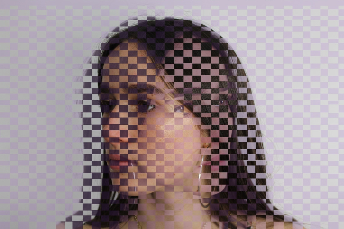
For this photograph i selected second layer and changed the colour overlay to a light pink/purple. i think this colour created a faint and simple difference to the image. I also changed the opacity of this layer so that the focus point of the image was more on the original colours.
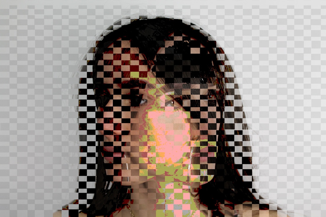
In this edit i firstly selected the magic wand tool and selected 3 different areas of the image. i then went to image - adjustments and selected the posterise effect. I thought this effect was effective as it not only brought bold colours to the image but also different textures which adds other focus points and contrasts to the image.
In this image i selected a much smaller area, however i first focused on editing the hope image. I changed the levels and the contrast of the image before adding the colour. I then used the quick selection tool to select the outline of one side of the models face. after selecting it i selected exclusion under layer style to create the blue.
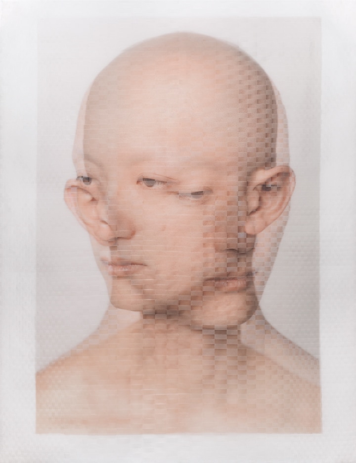
Third Response - Gifs
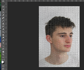
To further develop my portrait strand I made A gif's of two different people. I used the previous template of the small rectangles overlapped onto one of the pictures and changed the opacity of the photo on photoshop. I started on 0% and saved the image, each time increasing the opacity by 10% and then making this series of images into a gif. I did this twice with two different people as one gif had a black background and the other had a white so I wanted to see how the contrasting affected the gif. Additionally, I made them in order to incorporate the idea of fading memories, the pictures didn't show this as they were still and weren't woven like the artists.
Process of Photoshop
|
|
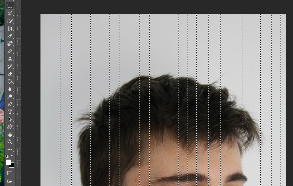
First you must select the rectangle marquee tool and select long rectangles vertically. then do the same horizontally so that it looks like you have selected lots of very separated circular rectangular shapes.
|
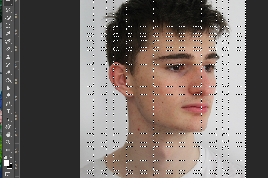
Then using the same tool draw a rectangle touching each point of the previous shapes. Once complete you should have several rectangles close together like shown on the right.
|
|
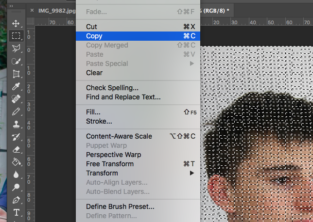
Then, simply copy the area you have selected and paste it onto the next layer.
|
Once these 5 steps are complete you can make the gif by changing the opacity of one of the layer and saving them each time. then go to file - scrips - load files into stack. Then you select all images and press ok. next go to window and get the timeline bar up as click create frame animation. Then you should have your gif.
STRAND 2 - Structure in London
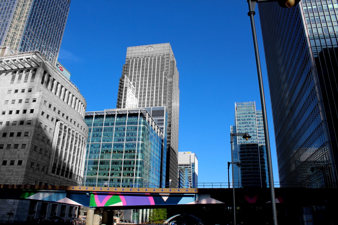
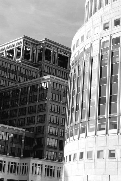
For this strand i wanted to explore the modern structure of buildings in London. I went to Canary Warf i i found that this location had a variety of different architecture and as i already photographed the typical modern buildings of London such as the Shard and the Gurkin, i thought that i should change locations. so that i got a variety of photos.
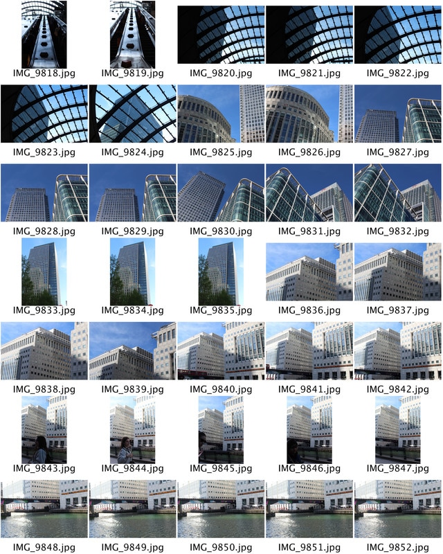
|
|
Here are 6 images i have selected which i think represent the structure of modern buildings the best. i like how each image gives different shades of colours to the table, as this creates a variety of different views and structures,
Edits
|
|
|
|
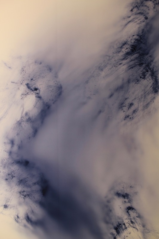
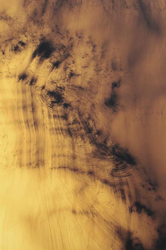
STRAND 3 - Structure of Shadows
I like the idea of exploring different ways for photographing shadows. I think the abstraction of each shadow is part of its structure as the lack of detail and simplicity creates its own structure.
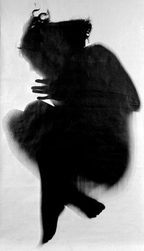
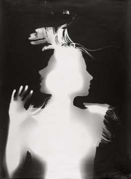
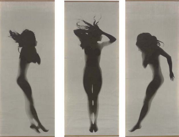
Floris Neusüss
Floris Neusüss has dedicated his whole career to extending the practice, study and teaching of the photogram. His works often deal in opposites: black and white, shadow and light, movement and stillness, presence and absence, and in the translation of three dimensions into two. By removing objects from their physical context, Neusüss encourages the viewer to contemplate the essence of form. He creates a feeling of surreal detachment, a sense of disengagement from time and the physical world. Collectively, his images explore themes of mythology, history, nature and the subconscious.
|
|
|
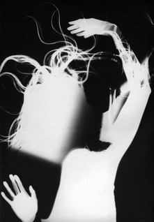
Neususs brought renewed ambition to the photogram process, in both scale and visual treatment, with the Körperfotogramms (or whole-body photograms) that he first exhibited in the 1960s. Since that time, he has consistently explored the photogram's numerous technical, conceptual and visual possibilities. This serious work contributed to part of a project named 'shadow catchers' where they create images on photographic paper by casting shadows and manipulating light, or by chemically treating the surface of the paper.
First Response
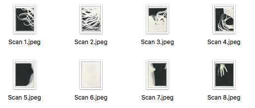
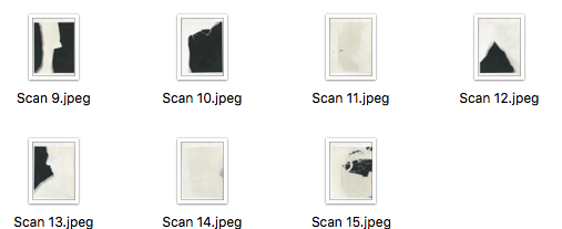
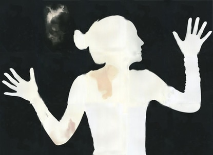
For my first response to neususs's work i used 15 sheets of photographic paper and made a 5 by 3 rectangle. using photographic paper meant that once these sheets were exposed to white light i could then develop each sheet through the developer stop and fix to create the same images as above. I used my friend as my model and asked her to stand up against the papers and then arranged her into a similar abstract position.
|
|
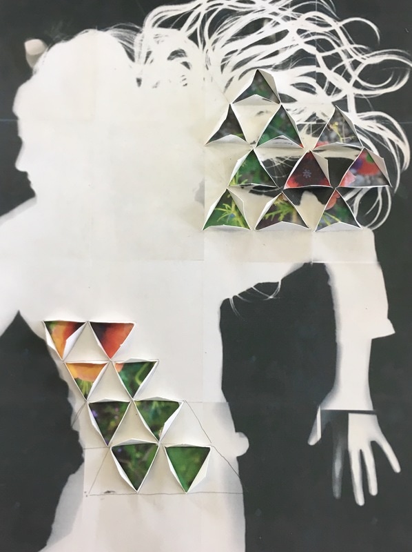
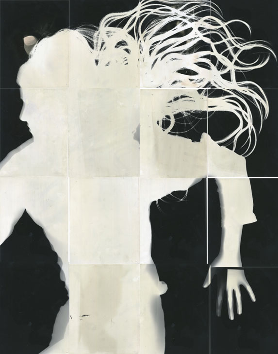
Using photoshop i then created a new international paper, resized each image and placed each image all together so that they fit perfectly inline with one another. I like the way you can see the gaps from the separated sheets of paper as i think this shows off a more external factor of structure as it brings out the more man made features.

To improve this response i should have left the individual sheets in the developer and fix for longer. this would have taken away the patches of orange and grey and left a more smooth overall tone.
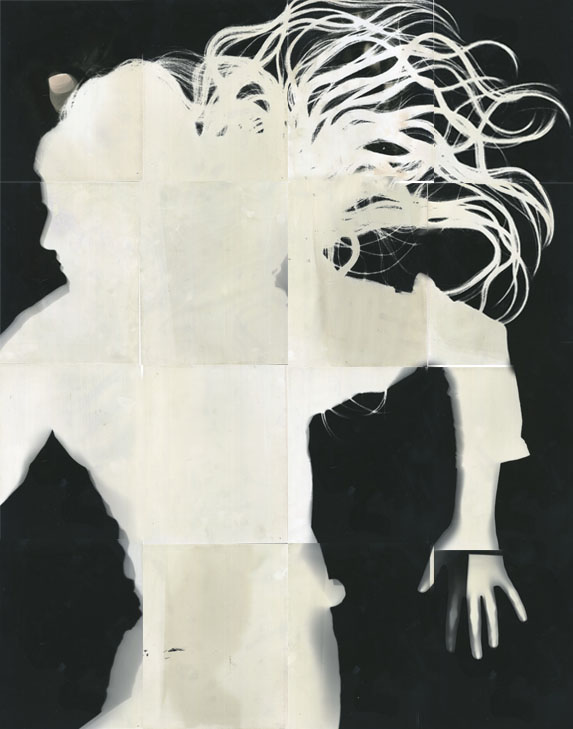
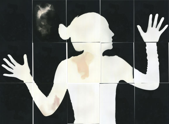
For this second response i laid 16 sheets of the photographic paper on the floor instead of the wall. This meant that i had to get the model to lay on the floor which was my intention as i wanted to capture the models hair placed out on the floor as i thought this would bring more structure to the image.
|
|
Here you can see that i used loose clothing which i will change for my next response so i get a clearer structure of the body. i really like the way the hair was displayed. i think it brings a more exciting factor to the image, as it portrays a real life human, and adds detail to the image. I left the sheets of paper in the developer fix and stop for much longer than last time, which worked as there are only very slight patches of darker colours, however looks much smoother than the last response.

For my next development i will try to make the model wear tighter clothing so that their body shape is more clear and there is no loose clothing. This will give us a clearer picture of the structure of their body through a straight on view. i think it will also make the image look much more tidier and professional.
First Development
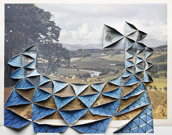
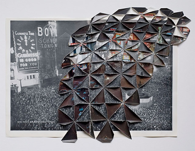
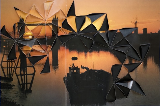
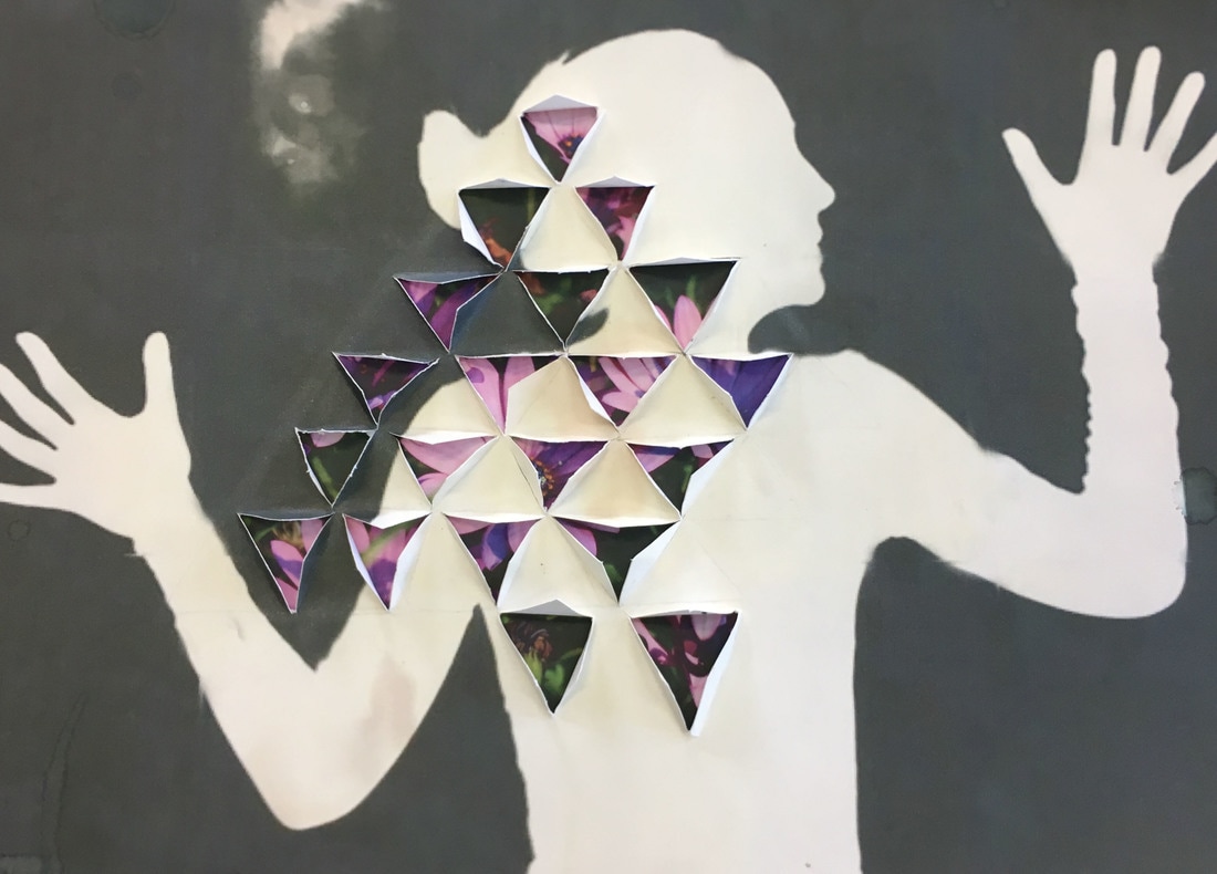
For my development of structure of shadows i decided to use Abigail Reynolds tecnique of cutting through paper to reveal an image or object in the back. Instead of using a black and white landscape picture with the coloured version in front i decided to use the photograms from my first response and something which meant a lot to the person in the image as the background, such as their ethnicity, their home back ground or something they're passionate about.
Abigail Reynolds
Abigail Reynolds takes the art of cutting paper to whole new levels, forming geometry, shape and inter-dimensionality from a singular plane. She carefully creates collages by combining pages from old books, atlases, encyclopedias and travel journals together, usually of urban and sometimes rural scenes. Abigail cleverly selects photos that have been taken from different angles, at different times and printed in different places but that capture the same thing. She then builds her photo collages, often by positioning a black and white monochrome photograph as a base layer then adds a coloured photograph on top to contrast. In a geometric like pattern Abigail cuts and folds the photos to create the illusion of looking through one photo into another, that becomes three-dimensional collage.
|
|
|
Abigail's work is unlike any photographic work I have ever seen and I love the intriguing qualities created by the layers, angles and patterns created in her work, reminiscent of origami sculptures. I love how the precise cut layers to not cover the entire photograph, just spread at random angles to create more geometric lines and patterns.
My Response
|
|

|
|
VISUAL BRAINSTORM
|
Floris Neusüss's work
|
This brain storm shows the process of development through 2 different artists combined. i thought that using both artists in one final outcome would be effect as it would bring different aspects of creativity to the image.
|
My Work
|
|
I used the two images on the left to create my final outcome...
|
Abigail Reynolds's work
|

To develop this i looked at artist abigail reynolds who used physical contact with her pictures to add more texture and style to them.
|

|
My Final Outcome
|
Final Piece
Floris Neusüss - Continued...
Floors Neusüss's work often deal in opposites: black and white, shadow and light, movement and stillness, presence and absence, and in the translation of three dimensions into two. By removing objects from their physical context, Neusüss encourages the viewer to contemplate the essence of form. He creates a feeling of surreal detachment, a sense of disengagement from time and the physical world. Collectively, his images explore themes of mythology, history, nature and the subconscious.
EXPERIMENTS...
Using flowerers i experimented with inverting the photographs from black and white to white and black. This trial and error process allowed me to find the right time to expose the paper to light and create the correct contrast between the inverted photo and the original.
MY WORK
FIRST ATTEMPT:
My first attempt showed that i hadn't fixed the image for long enough or covered the whole sheet of paper with developer which left it looking patchy and not smooth or even. The outline however of my model was clear which was successful as precious tried the paper had been exposed for too long and i ended up with a completely black sheet of paper. To improve the response i will try and lay the chemicals on the paper evenly and have the model lay on the ground so that her positioning looks more natural.
FINAL PIECES
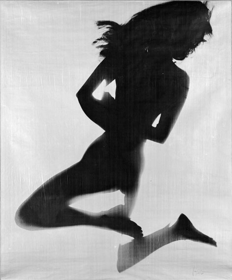
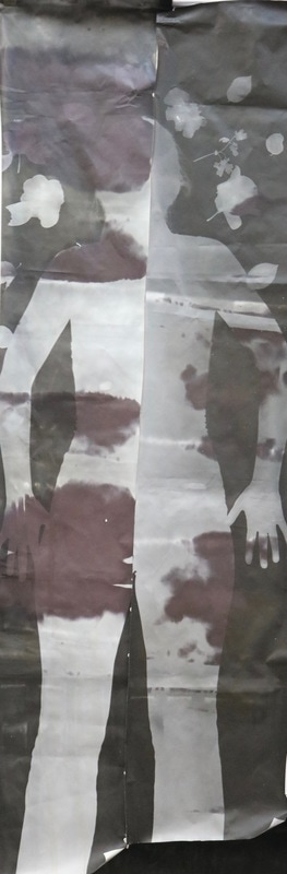
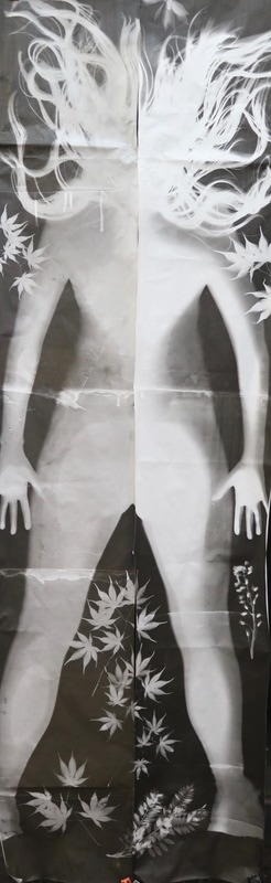
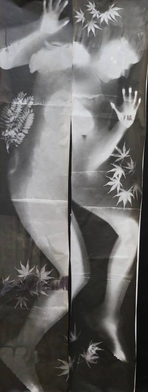
For my final piece i concentrated on photograms, however to make my response more sophisticated i brought in any different factors to the images to make the images more eye catching and interesting, with much more context. . Instead of using individual sheets of A4 paper i also changed it to using rolls of photographic paper. This allowed me to capture full body silhouettes, which will allow the audience to see more of a structure of the body of the model. This also linked to Neusüss full body work as seen down below which was my first inspiration for my final piece. I also used three different body types, representing the fact that 'all sizes are beautiful'. To represent the beauty i included flowers and leaves in the photograms. i thought that this would improve the mood of the image and create a brighter more feminine tone. To add more structure to the image i also added normal A4 sizes of photographic paper onto the roll. this meant i could processes them sepratley and allowed me to edit them separately from the whole roll of paper. i took these 4 pieces of A4 and inverted them. I then added them back to the roll to create more of an abstract look.
|
|
